Home
Class 6
MATHS
Following table shows the number of bicy...

Following table shows the number of bicycles manufactured in a factory during the years 1998 to 2002. Illustrate this data using a bar graph. Choose a scale of your choice

Promotional Banner

Topper's Solved these Questions

  • DATA HANDLING-II (PICTOGRAPHS)

    RD SHARMA ENGLISH|Exercise All Questions|13 Videos
  • DATA HANDLING-IN (PRESENTATION OF DATA)

    RD SHARMA ENGLISH|Exercise All Questions|14 Videos

Similar Questions

Explore conceptually related problems

The following table gives the numbers of failures of commercial industries in a country during the years 2000 to 2015. Draw a graph illustrating these figure. Calculate the 4 yearly moving averages and plot them on the same graph.

The following table shows the ages of the patients admitted in a hospital during a year:Find the mode and the mean of the data given above. Compare and interpret the two measures of central tendency.

The following table gives the height of five trees in a garden. If the given data has to be represented as a bar graph, then select the most appropriate scale from the given options that can be used to draw the bar graph. 1 unit = 8 trees

The following table gives the height of five trees in a garden. If the given data has to be represented as a bar graph, then select the most appropriate scale from the given options that can be used to draw the bar graph. 1 unit = 5 trees

The following table gives the height of five trees in a garden. If the given data has to be represented as a bar graph, then select the most appropriate scale from the given options that can be used to draw the bar graph. 1 unit = 1 trees

The following table gives the height of five trees in a garden. If the given data has to be represented as a bar graph, then select the most appropriate scale from the given options that can be used to draw the bar graph. 1 unit = 20 trees

The following bar graph shows the number of persons killed in industrial accidents in a country for some years (Figure) Read the bar graph and choose the correct alternative in each of the following: The year which shows the maximum percentage increase in the number of persons killed in coal mines over the preceding year is: (a) 1996 (b) 1997 (c) 1999 (d) 2000

The following bar graph shows the number of vehicles passing through a road crossing in Delhi in different time intervals on a particular day. Read the bar graph and answer the following questions: What does the bar graph represent? Also, give the maximum number of vehicles. When is the hourly traffic maximum? Also give the minimum number of vehicles. When is the hourly traffic minimum? What is the total number of vehicles passing through a crossing during a particular day?

The bar graph given alongside shows the amount of wheat purchased by government during the year 1998-2002. Read the bar graph and write down your observations. In which year was (a) the wheat production maximum? (b) the wheat production minimum?

RD SHARMA ENGLISH-DATA HANDLING-III (BAR GRAPHS)-All Questions
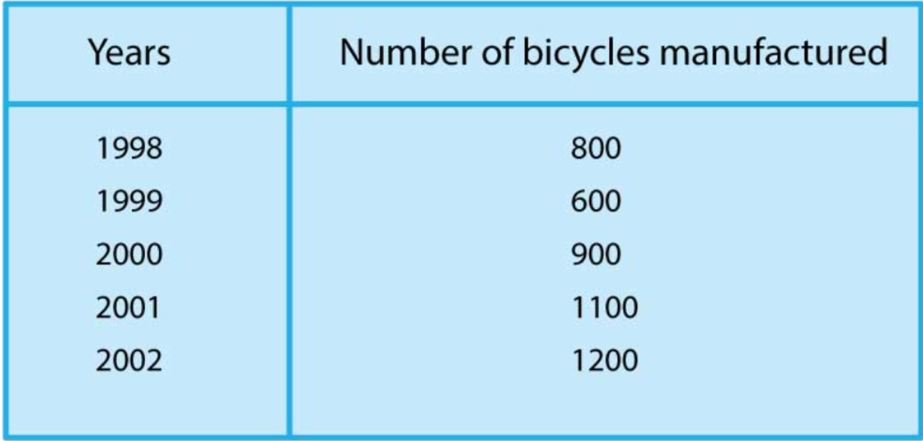
  1. Following table shows the number of bicycles manufactured in a factory...

    Text Solution

    |

  2. The following table gives the number of vehicles passing through a ...

    Text Solution

    |

  3. The following bar graph represents the data for different sizes of sho...

    Text Solution

    |

  4. The following bar graph shows the number of vehicles passing throug...

    Text Solution

    |

  5. Read the bar graph shown in Figure and answer the following questio...

    Text Solution

    |

  6. Read the following bar graph shown in Figure and answer the followi...

    Text Solution

    |

  7. Read the following bar graph given in Figure and answer the followi...

    Text Solution

    |

  8. The following table shows the daily production of T.V. sets in an i...

    Text Solution

    |

  9. The following table shows the number of Maruti cars sold by the five d...

    Text Solution

    |

  10. The population of Delhi State in different census years is as given...

    Text Solution

    |

  11. Read the bar graph shown in Figure and answer the following questio...

    Text Solution

    |

  12. Study the bar graph representing the number of persons in various age ...

    Text Solution

    |

  13. Read the bar graph shown in Figure and answer the following questio...

    Text Solution

    |

  14. Given below (figure) is the bar graph indicating the marks obtained...

    Text Solution

    |

  15. Read the following bar graph (Figure) and answer the following ques...

    Text Solution

    |

  16. Read the following bar graph and answer the following questions: Wh...

    Text Solution

    |

  17. The following bar graph (Figure) represents the heights (in cm) of ...

    Text Solution

    |

  18. Read the following bar graph (Figure) and answer the following ques...

    Text Solution

    |

  19. The bar graph shown in Figure represents the circulation of newspap...

    Text Solution

    |

  20. The following data gives the number of students of Delhi state who w...

    Text Solution

    |