A
B
C
D
Text Solution
Verified by Experts
The correct Answer is:


Topper's Solved these Questions
STATISTICS AND DATA INTERPRETATION
KIRAN PUBLICATION|Exercise TYPE-III|39 VideosSTATISTICS AND DATA INTERPRETATION
KIRAN PUBLICATION|Exercise TYPE-IV|182 VideosSTATISTICS AND DATA INTERPRETATION
KIRAN PUBLICATION|Exercise TYPE-VIII|8 VideosSIMPLIFICATION
KIRAN PUBLICATION|Exercise TEST YOURSELF|25 VideosTIME AND DISTANCE
KIRAN PUBLICATION|Exercise Type -XI|74 Videos
Similar Questions
Explore conceptually related problems
KIRAN PUBLICATION-STATISTICS AND DATA INTERPRETATION-TYPE-II
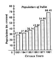
- The Bar Graph given here shows the population (in crores) of India in...
Text Solution
|
- The Bar Graph given here shows the population (in crores) of India in...
Text Solution
|
- The Bar Graph given here shows the population (in crores) of India in...
Text Solution
|
- The Bar Graph given here shows the population (in crores) of India in...
Text Solution
|
- Given here is a bar graph showing the number of cycles produced in a f...
Text Solution
|
- Given here is a bar graph showing the number of cycles produced in a f...
Text Solution
|
- Given here is a bar graph showing the number of cycles produced in a f...
Text Solution
|
- Study the following graph and answer the questions given below it. ...
Text Solution
|
- Study the following graph and answer the questions given below it. ...
Text Solution
|
- Study the following graph and answer the questions given below it. ...
Text Solution
|
- Study the following graph and answer the questions given below it. ...
Text Solution
|
- Read the following graph and answer questions The deficit in 1993...
Text Solution
|
- Read the following graph and answer questions Percenatge increase...
Text Solution
|
- Read the following graph and answer questions In which of the fol...
Text Solution
|
- Read the following graph and answer questions The ratio of the nu...
Text Solution
|
- Read the following graph and answer questions The deficit in 1992...
Text Solution
|
- Sales of books (in thousands) from six branches (B1, B2, B3, B4, B5, B...
Text Solution
|
- Sales of books (in thousands) from six branches (B1, B2, B3, B4, B5, B...
Text Solution
|
- Sales of books (in thousands) from six branches (B1, B2, B3, B4, B5, B...
Text Solution
|
- Sales of books (in thousands) from six branches (B1, B2, B3, B4, B5, B...
Text Solution
|