Home
Class 10
MATHS
The pie diagram represents the amount sp...

The pie diagram represents the amount spent on different sports by a school administration in a year. If the money spent on football is `Rs9000`, answer the following questions :
`i.` What is the total amount spent on sports?
`ii`. What is the amount spent on hockey?
`iii`. How much more amount is spent on tennis than on basket ball?

Text Solution

Verified by Experts

The correct Answer is:
`i. Rs72000`
`ii. Rs 20000`
`iii. Rs 3000`
Promotional Banner

Topper's Solved these Questions

  • STATISTICS

    TARGET PUBLICATION|Exercise Try this|2 Videos
  • STATISTICS

    TARGET PUBLICATION|Exercise Multiple Choice Questions|14 Videos
  • SIMILARITY

    TARGET PUBLICATION|Exercise Chapter Assessment|19 Videos
  • TRIGONOMETRY

    TARGET PUBLICATION|Exercise Chapter Assessment|18 Videos

Similar Questions

Explore conceptually related problems

Observe the pie diagram. If the amount spent on football per year is RS 9000, answer the following questions : (i) What is the total amount spent on sports? (ii) What is the amount spent on hockey?

If the total amount spent on sports during the year was Rs. 2 crore, the amount spent on circket hockey together was

The pie chart, given here, shows the amount of money spent on various sports by a school administration in a particular year. Observe the pie chart and answer the questions based on this graph If the money spent on football was Rs. 9,000, what amount was spent on Cricket?

The pie chart, given here, shows the amount of money spent on various sports by a school administration in a particular year. Observe the pie chart and answer the questions based on this graph If the money spent on football is Rs. 9,000, then what was the total amount spent on all sports ?

The pie chart, given here, shows the amount of money spent on various sports by a school administration in a particular year. Observe the pie chart and answer the questions based on this graph If the money spent on football was Rs. 9,000 how much more money was spent on hockey than on football ?

The given pie chart shows the amount of money spent by a school on various sports in the year 2015. Study the pie chart carefully and answer the following question. (i) If the amount spent on football was Rs. 9000, then how much more money was spent on hockey than on football ? (ii) If the amount spent on football Rs. 9000, then what was the total amount spent on all sports ?

A pie diagram represents the number of hours spent by a school boy in different activites in a day. If 7 hours are spent in school, then what is the measure of the central angle?

TARGET PUBLICATION-STATISTICS-Problem Set-6
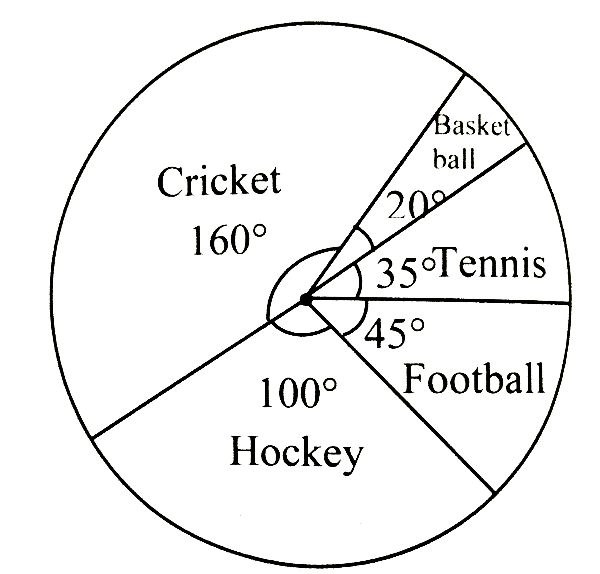
  1. The pie diagram represents the amount spent on different sports by a s...

    Text Solution

    |

  2. Choose the correct alternative among the following : The persons of...

    Text Solution

    |

  3. Different expenditures incurred on the construction of a building were...

    Text Solution

    |

  4. Cumulative frequencies in a grouped frequency table are useful to find...

    Text Solution

    |

  5. In the formula bar(x)=a+h(sumf(i)u(i))/(sumf(i)) for finding the mea...

    Text Solution

    |

  6. The median of the distances covered per litre shown in the above data ...

    Text Solution

    |

  7. The above data is to be shown by a frequency polygon. The coordinates ...

    Text Solution

    |

  8. The following table shows the income of formers in a grape season. Fin...

    Text Solution

    |

  9. The loans sanctioned by a bank for construction of farm ponds are show...

    Text Solution

    |

  10. The weekly wages of 120 workers in a factory are shown in the followin...

    Text Solution

    |

  11. The following frequency distribution table shows the amount of aid giv...

    Text Solution

    |

  12. The distances covered by 250 public transport buses in a day is shown ...

    Text Solution

    |

  13. The prices of different articles and demand for them is shown in the f...

    Text Solution

    |

  14. The following frequency table shows the demand for a sweet and the num...

    Text Solution

    |

  15. Draw a historgram for the following frequency distribution

    Text Solution

    |

  16. The time required for some students to complete a science experiment a...

    Text Solution

    |

  17. Draw a frequency polygon for the following grouped frequency distrbuti...

    Text Solution

    |

  18. Observe the given pie diagram. It shows the percentages of number of v...

    Text Solution

    |

  19. The following table shows causes of noise pollution. Show it by a pie ...

    Text Solution

    |

  20. A survey of students was made to know which game they like. The data o...

    Text Solution

    |

  21. Medical check up of 180 woman was conducted in a health centre in a vi...

    Text Solution

    |