


Topper's Solved these Questions
STATISTICS
TARGET PUBLICATION|Exercise Apply your knowledge|5 VideosSTATISTICS
TARGET PUBLICATION|Exercise Chapter Assessment|15 VideosSTATISTICS
TARGET PUBLICATION|Exercise Multiple Choice Questions|14 VideosSIMILARITY
TARGET PUBLICATION|Exercise Chapter Assessment|19 VideosTRIGONOMETRY
TARGET PUBLICATION|Exercise Chapter Assessment|18 Videos
Similar Questions
Explore conceptually related problems
TARGET PUBLICATION-STATISTICS-Additional Problems for Practice
- Draw a histogram representing the following distribution.
Text Solution
|
- Draw a histogram representing the following distribution.
Text Solution
|
- The marks scored by students in Mathematics in a certain examinations ...
Text Solution
|
- Represent the following data by histogram:
Text Solution
|
- The following is the frequency distribution of waiting time at ATM cen...
Text Solution
|
- The table below shows the net asset value (NAV) per unit of mutual fun...
Text Solution
|
- Draw frequency polygon for the following frequency distribution.
Text Solution
|
- The following table shows the weights of children and the number of ch...
Text Solution
|
- Answer the following questions based on the frequency polygon given in...
Text Solution
|
- In a bicycle shop, number of bicycles purchased and choice of their co...
Text Solution
|
- Area under different crops n a certain village is given below : Repres...
Text Solution
|
- Area under different crops n a certain village is given below : Repres...
Text Solution
|
- The number of hours spent by a school boy in different activities in a...
Text Solution
|
- The marks obtained by a student in an examination are given below: ...
Text Solution
|
- The marks obtained by a student in an examination are given below: The...
Text Solution
|
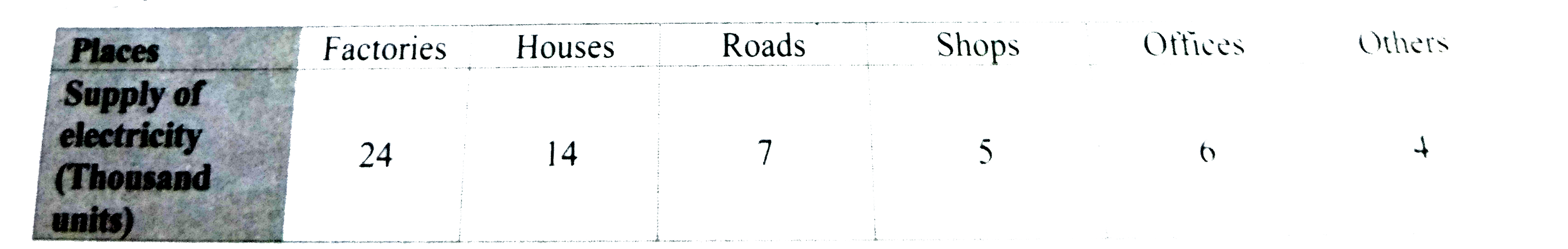
- The following table shows the daily supply of electricity to different...
Text Solution
|
- The adjoining pie-diagram shows the S.S.C result of 5 boards. Study th...
Text Solution
|
- The following pie diagram represents the sectorwise loan amount in cro...
Text Solution
|
- The following pie diagram represents expenditure on different items in...
Text Solution
|
- As deduced from a survey, the classification of skilled workers is sho...
Text Solution
|