


Topper's Solved these Questions
Similar Questions
Explore conceptually related problems
TARGET PUBLICATION-STATISTICS-Practise Set 6.6
- The age group and numbe of persons, who denoted blood in a blood donat...
Text Solution
|
- The marks obtained by a student in different subjects are shown. Draw ...
Text Solution
|
- In a tree plantation programme, the number of trees planted by student...
Text Solution
|
- The following table shows the percentages of demands for different fru...
Text Solution
|
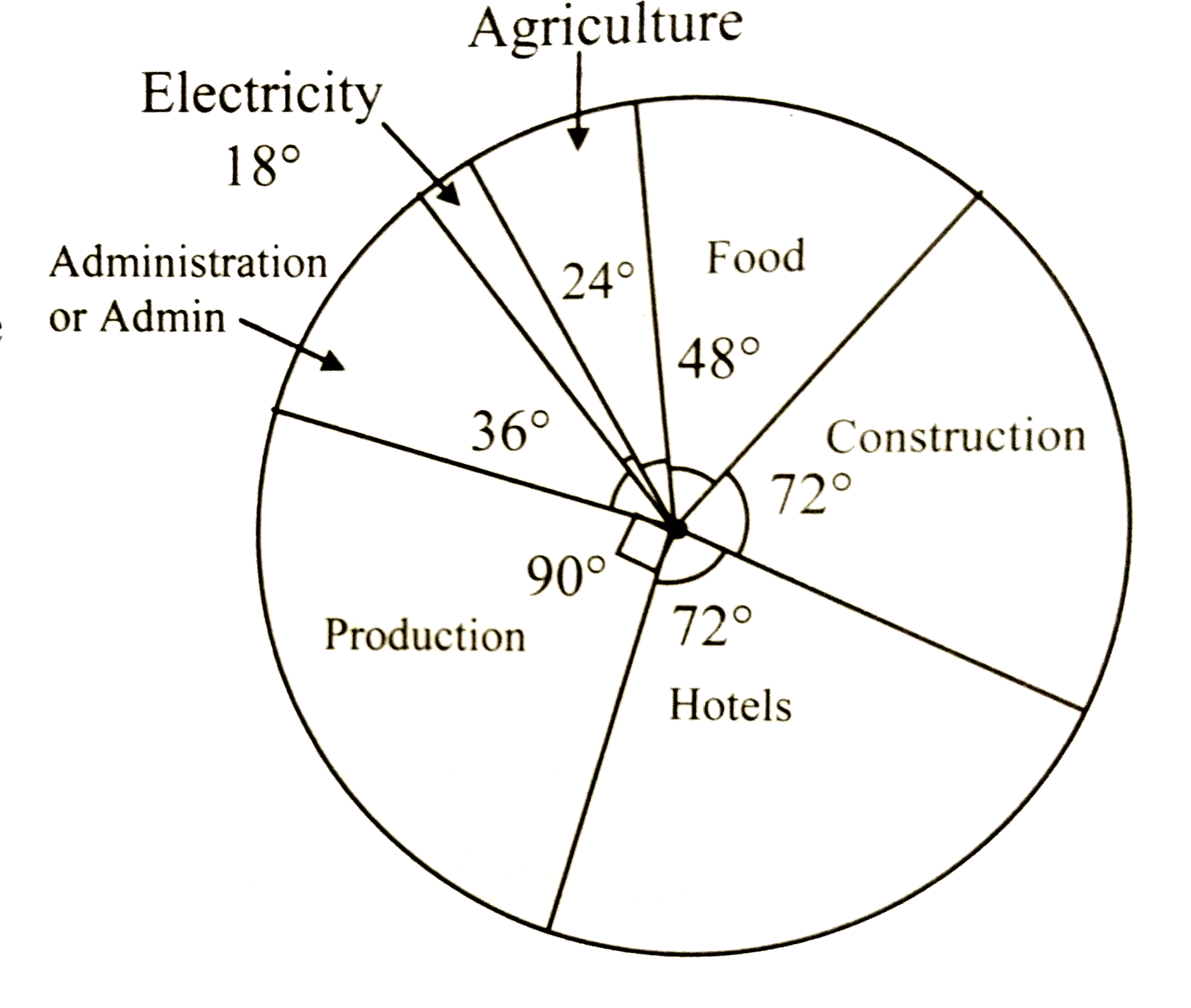
- The pie diagram in the given figure shows the proportions of different...
Text Solution
|
- The annual investments of a family are shown in the given pie diagram....
Text Solution
|