Home
Class 9
MATHS
The following data gives the value (in...

The following data gives the value (in crores of rupees) of the Indian export of cotton textiles for different years:

Represent the above data with the help of a bar graph. Indicate with the help of a bar graph the year in which the rate of increase in exports is maximum over the preceding year.

Text Solution

Verified by Experts

Promotional Banner

Topper's Solved these Questions

  • FACTORIZATION OF POLYNOMIAL

    RD SHARMA|Exercise All Questions|220 Videos
  • HERON'S FORMULA

    RD SHARMA|Exercise All Questions|102 Videos

Similar Questions

Explore conceptually related problems

The following data gives the amount of loans (in crores of rupees) disbursed by a bank during some years: Year, 1992, 1993, 1994, 1995, 1996 Loan (in crores of rupees), 28, 33, 55, 55, 80 Represent the above data with the help of a bar graph. With the help of the bar graph, indicate the year in which amount of loan is not increased over that of the preceding year.

The following data gives the amount of manure (in thousand tonnes) manufactured by a company during some years: Year, 1992, 1993, 1994, 1995, 1996, 1997 Manure (In thousand tonnes), 15, 35, 45, 30, 40, 20 Represent the above data with the help of a bar graph. Indicate with the help of the bar graph the year in which the amount of manure manufactured by the company was maximum. Choose the correct alternative: The consecutive years during which there was maximum decrease in manure production are: 1994 to 1995 (b) 1992 and 1993 1996-1997 (d) 1995 and 1996

Read the bar graph given below and answer the following questions: In which year is the increase in number of students maximum as compared to the previous year?

The following table shows the number of fruits in a fruit shop.Represent the above data by a bar graph

Study the following graph carefully and answer the given questions. Which year has the highest per cent increase/decrease in exports as compared to the preceding year ?

Study the following bar graph and answer the question that follows. In which year was the maximum percentage increase in diamond exports compared to the previous year?

. The following data shows the year wise strength of a school.Represent the the above data by bar graph:

The following table gives the data of number of schools (stage-wise) of a country in the year 2002. Draw a bar graph to represent the above data:

RD SHARMA-GRAPHICAL REPRESENTATION OF STATISTICAL DATA-All Questions
  1. The following data gives the demand estimates of the Government of I...

    Text Solution

    |

  2. The investment (in ten crores of rupees) of the Life Insurance Corpo...

    Text Solution

    |

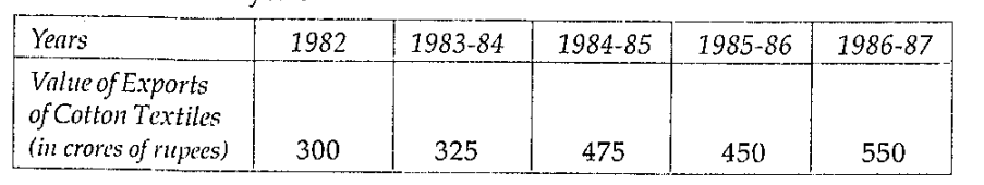
  3. The following data gives the value (in crores of rupees) of the In...

    Text Solution

    |

  4. The production of oil (in lakh tonnes) in some of the refineries ...

    Text Solution

    |

  5. The expenditure (in 10 crores of rupees) on health by the Govern...

    Text Solution

    |

  6. The following table gives the marks scored by 100 students in an ent...

    Text Solution

    |

  7. The following is the distribution of weights (in kg) of 50 persons:...

    Text Solution

    |

  8. Represent the following data by means of historgram.

    Text Solution

    |

  9. Draw a histogram for the marks of students given below :

    Text Solution

    |

  10. The given table presents the number of illiterate males in the age gro...

    Text Solution

    |

  11. For the following data, draw a histogram and a frequency polygon:

    Text Solution

    |

  12. Construct a histogram for the following data:

    Text Solution

    |

  13. Draw a histogram for the daily earnings of 30 drug stores in the fol...

    Text Solution

    |

  14. The monthly profits (in Rs.) of 100 shops are distributed as follows...

    Text Solution

    |

  15. Which one of the following is not the graphical representation of st...

    Text Solution

    |

  16. In a frequency distribution, ogives are graphical representation of 1...

    Text Solution

    |

  17. A frequency polygon is constructed by plotting frequency of the class ...

    Text Solution

    |

  18. In a histogram the area of each rectangle is proportional to 1)the cl...

    Text Solution

    |

  19. In a histogram the class intervals or the groups are taken along ...

    Text Solution

    |

  20. A histogram is a pictorial representation of the grouped data in whi...

    Text Solution

    |