Home
Class 6
MATHS
The following bar graph shows the number...

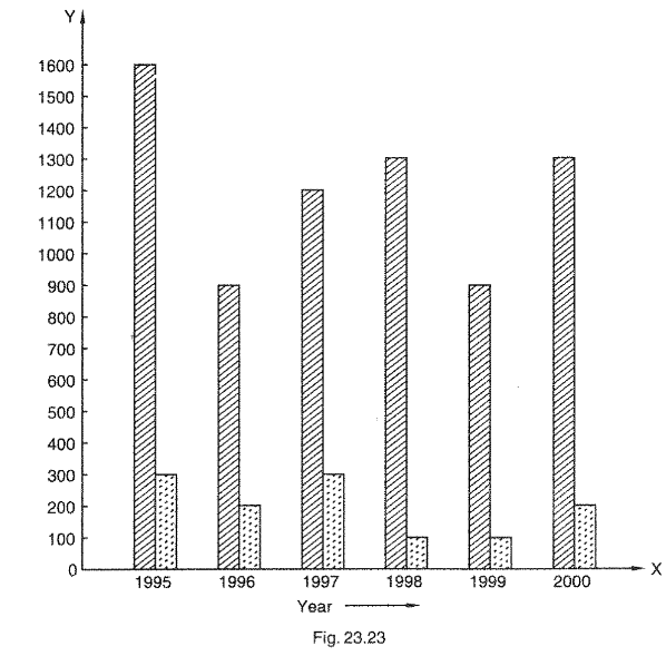
The following bar graph shows the number of persons killed in industrial accidents in a country for some years (Figure) Read the bar graph and choose the correct alternative in each of the following: The year which shows the maximum percentage increase in the number of persons killed in coal mines over the preceding year is: (a) 1996      (b)  1997      (c)  1999      (d)  2000 The year which shows the maximum decrease in the number of persons killed in industrial accidents over the preceding year is: (a) 1996      (b)  1997      (c)  1998      (d)  2000 The year in which the maximum number of persons were killed in industrial accidents other than those killed in coal mines is: 1995      (b)  1997      (c)  1998      (d)  1999

Promotional Banner

Topper's Solved these Questions

  • DATA HANDLING-II (PICTOGRAPHS)

    RD SHARMA|Exercise All Questions|13 Videos
  • DATA HANDLING-IN (PRESENTATION OF DATA)

    RD SHARMA|Exercise All Questions|14 Videos

Similar Questions

Explore conceptually related problems

Study the following bar graph and answer the question that follows. In which year was the maximum percentage increase in diamond exports compared to the previous year?

The bar graph shows the number of students (in hundreds) admitted and passed out per year in a college during the years 2010 to 2014. Study the bar graph and answer the question. In which of the following years, was the pass percentage between 80 and 85?

The following data shows the number of students born in different months of a particular year of class VI. Make the bar graph based on the given information.

Read the following graph and answer questions In which of the following years, the percent increase of deficit was highest over its preceding year?

Read the bar graph given below and answer the following questions: In which year is the number of students maximum?

Read the bar graph given below and answer the following questions: In which year is the increase in number of students maximum as compared to the previous year?

Draw a bar graph using the data given in the following table, which shows the number of bikes manufactured in a factory during the years 2010 to 2013.

The following bar graph shows the number of students in a particular class of school. Then, answer the following questions. What is the number of students in the year 2003?

The following bar graph shows the number of students in a particular class of school. Then, answer the following questions. What is the number of students in the year 2003?

RD SHARMA-DATA HANDLING-III (BAR GRAPHS)-All Questions
  1. Read the following bar graph and answer the following questions: Wh...

    Text Solution

    |

  2. The following bar graph (Figure) represents the heights (in cm) of ...

    Text Solution

    |

  3. Read the following bar graph (Figure) and answer the following ques...

    Text Solution

    |

  4. The bar graph shown in Figure represent the circulation of newspape...

    Text Solution

    |

  5. The following data gives the number of students of Delhi state who ...

    Text Solution

    |

  6. In a school, there are five sections of class VII. The number of st...

    Text Solution

    |

  7. The population of four major cities in India in a particular year i...

    Text Solution

    |

  8. The results of pass percentage of Class X and XII in C.B.S.E examin...

    Text Solution

    |

  9. Reading and interpretation of bar graphs

    Text Solution

    |

  10. Read the following bar graph and answer the following question: Wha...

    Text Solution

    |

  11. The following bar graph shows the results of an annual examination ...

    Text Solution

    |

  12. The following bar graph shows the number of persons killed in indust...

    Text Solution

    |

  13. The production of saleable steel in some of the steel plants of our...

    Text Solution

    |

  14. The following data gives the number (in thousands) of applicants re...

    Text Solution

    |

  15. The following table gives the route length (in thousand kilometres)...

    Text Solution

    |

  16. The following data gives the amount of loans (in crores of rupees) ...

    Text Solution

    |

  17. The following table shows the interest paid by a company (in lakhs)...

    Text Solution

    |

  18. The following data shows the average age of men in varicus countrie...

    Text Solution

    |

  19. The following data gives the production of food grains (in thousand...

    Text Solution

    |

  20. The following data gives the amount of manure (in thousand tonnes) ...

    Text Solution

    |