A
B
C
D
Text Solution
Verified by Experts
The correct Answer is:


Topper's Solved these Questions
ENGLISH SAT-PROBLEM SOLVING AND DATA ANALYSIS-Multiple Choice
- Q. If a state is chosen at random, what is the probability that the mi...
Text Solution
|
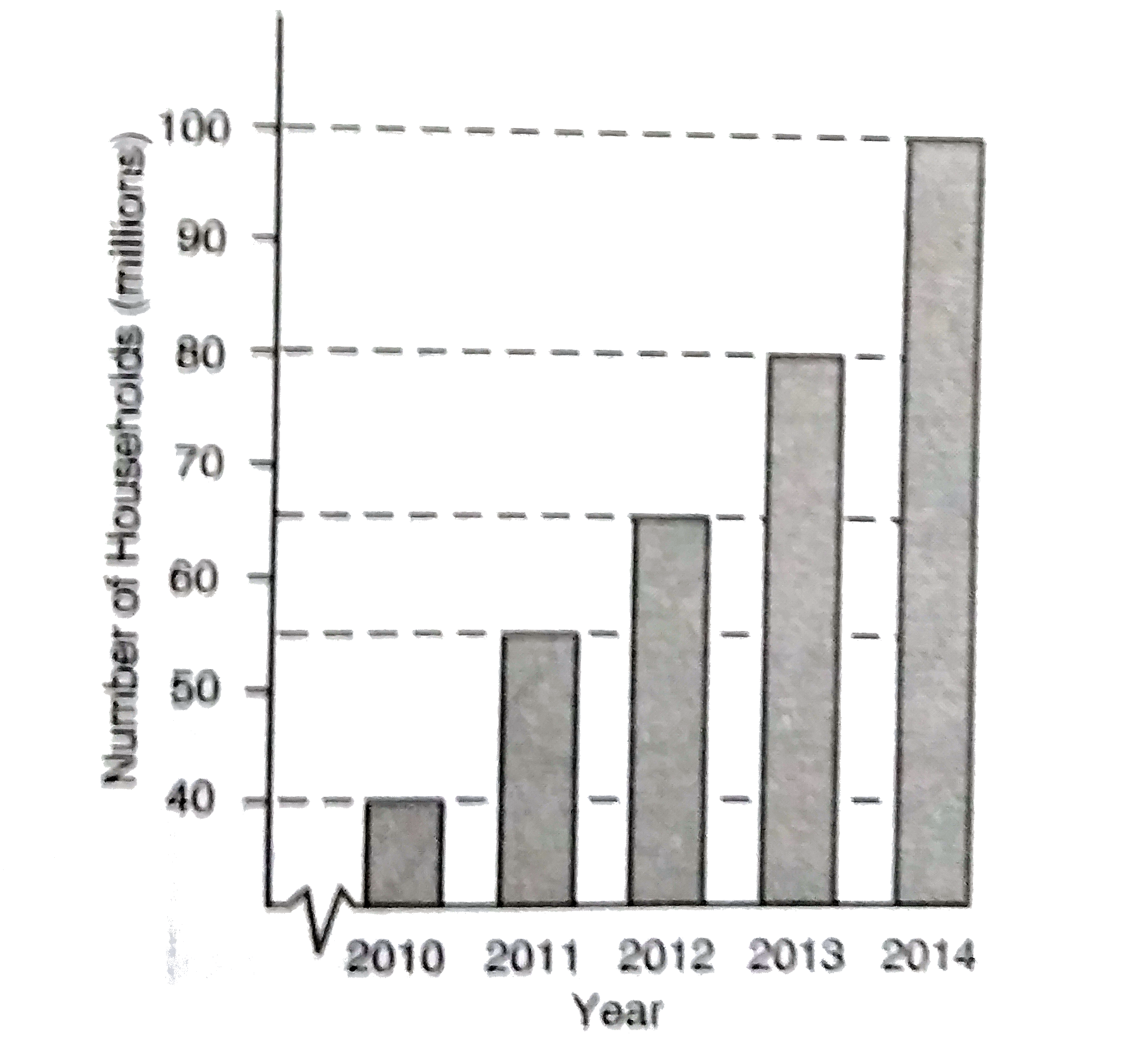
- The graph above shows the number of U.S. households with laptop comput...
Text Solution
|
- The graph above shows the number of U.S. households with laptop comput...
Text Solution
|
- The graph above graphs how $250,000 is invested. Q. How much money ...
Text Solution
|
- The graph above graphs how $250,000 is invested. Q. After 20% of the...
Text Solution
|
- Q. The percent increase in the number of students enrolled in advanced...
Text Solution
|
- Q. From 2014 to 2015 the number of students enrolled in advanced mathe...
Text Solution
|
- Q. In 2012, the number of cars purchased was x percent of the number o...
Text Solution
|
- Question 11 and 12 refer to the gaph above. Q. Which of the followin...
Text Solution
|
- Question 13 and 14 refer to the gaph above which shows the heart rate,...
Text Solution
|
- Question 13 and 14 refer to the gaph above which shows the heart rate,...
Text Solution
|
- The table above can be used to approximate the circumference of the he...
Text Solution
|
- The cumulative histrogram above shows the distribution of scores that ...
Text Solution
|
- The table above shows the composition of a coed high school tennis tea...
Text Solution
|
- Which survey is most likely to have the least bais?
Text Solution
|
- Erica is conducting a survey about the proposed increase in the sports...
Text Solution
|
- The table above summarizes the number of people by age group who were ...
Text Solution
|
- The scatterplot above shows the profit, by month, for a new company fo...
Text Solution
|
- A new fitness class was started at several fitness clubs owned by the ...
Text Solution
|
- A new fitness class was started at several fitness clubs owned by the ...
Text Solution
|