Text Solution
Verified by Experts


Topper's Solved these Questions
Similar Questions
Explore conceptually related problems
NCERT EXEMPLAR-STATISTICS AND PROBABILITY-LONG ANSWER TYPE QUESTIONS
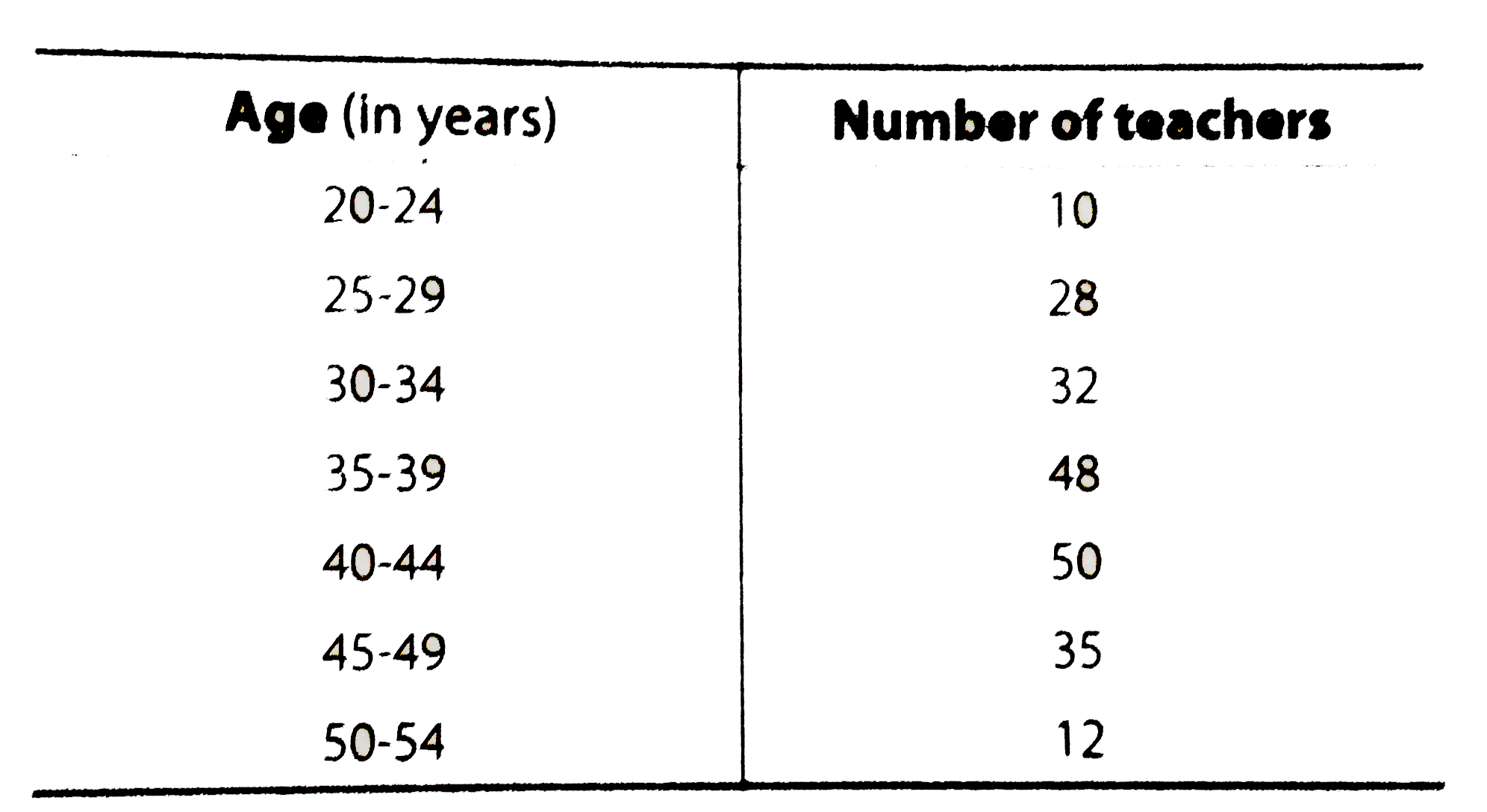
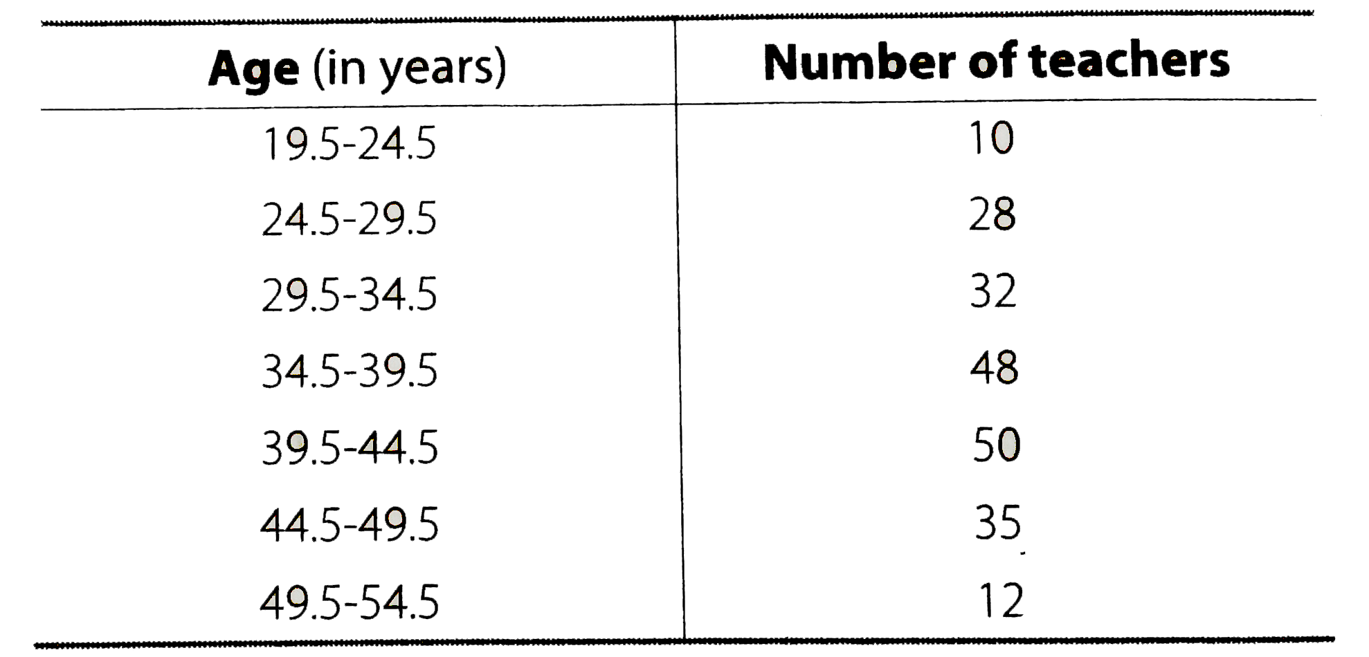
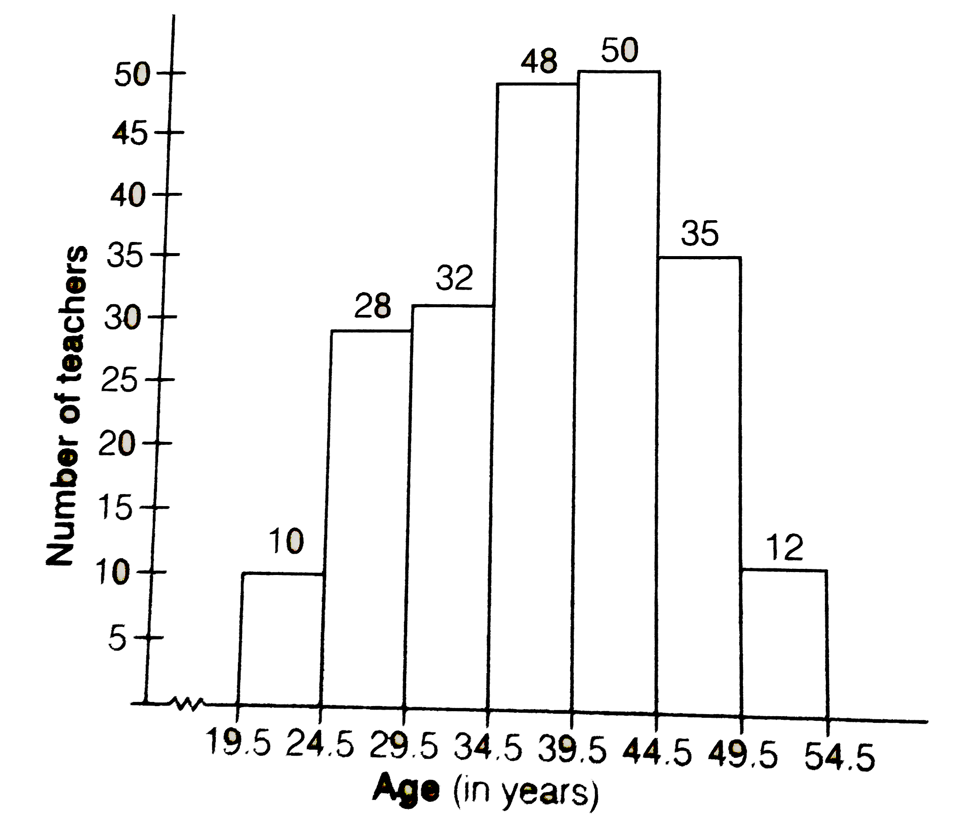
- Draw a histogram to represent the following grouped frequency distribu...
Text Solution
|
- The following are the marks (out of 100) of 60 students in Mathematics...
Text Solution
|
- Construct a grouped frequency distribution table with width 10 of each...
Text Solution
|
- The marks obtained (out of 100) by a class of 80 students are given be...
Text Solution
|
- Following table shows a frequency distribution for the speed of cars p...
Text Solution
|
- Refer to Q. 7. Draw the frequency polygon representing the above data ...
Text Solution
|