


Topper's Solved these Questions
Similar Questions
Explore conceptually related problems
RS AGGARWAL-PIE CHARTS -Exercise 24A
- The monthly income of a family is Rs.28800.The monthly expenditure o...
Text Solution
|
- There are 900 creatures in a zoo as per list given below : Rep...
Text Solution
|
- Various modes of transport used by 1260 students in a given school are...
Text Solution
|
- The data given below shows a number of hours spent by a school boy on ...
Text Solution
|
- The data on religionwise division of 1080 workers of a factory are giv...
Text Solution
|
- The marks obtained by Sudhir in an examination are given below: ...
Text Solution
|
- The following table gives the number of different fruits kept in a h...
Text Solution
|
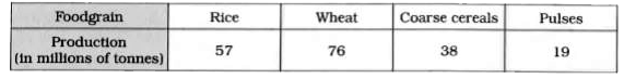
- The following data shows the agricultural production in India during a...
Text Solution
|
- Given below is the result of an annual examination of a class, showin...
Text Solution
|
- The following table shows the percentage of buyers of four different b...
Text Solution
|