


Topper's Solved these Questions
STATISTICS
PEARSON IIT JEE FOUNDATION|Exercise CONCEPT APPLICATION Level - 1|14 VideosSTATISTICS
PEARSON IIT JEE FOUNDATION|Exercise Level 2|22 VideosSTATISTICS
PEARSON IIT JEE FOUNDATION|Exercise Short Answer Type|21 VideosSIMPLE INTEREST AND COMPOUND INTEREST
PEARSON IIT JEE FOUNDATION|Exercise Level 3|9 Videos
Similar Questions
Explore conceptually related problems
PEARSON IIT JEE FOUNDATION-STATISTICS-Essay Type
- Find the central angles of the components of a data given below, when ...
Text Solution
|
- For the information given in the above question, find the heights of t...
Text Solution
|
- The percentage of marks obtained by a student in various exams is give...
Text Solution
|
- The following table shows the favourite games of 240 students of a sch...
Text Solution
|
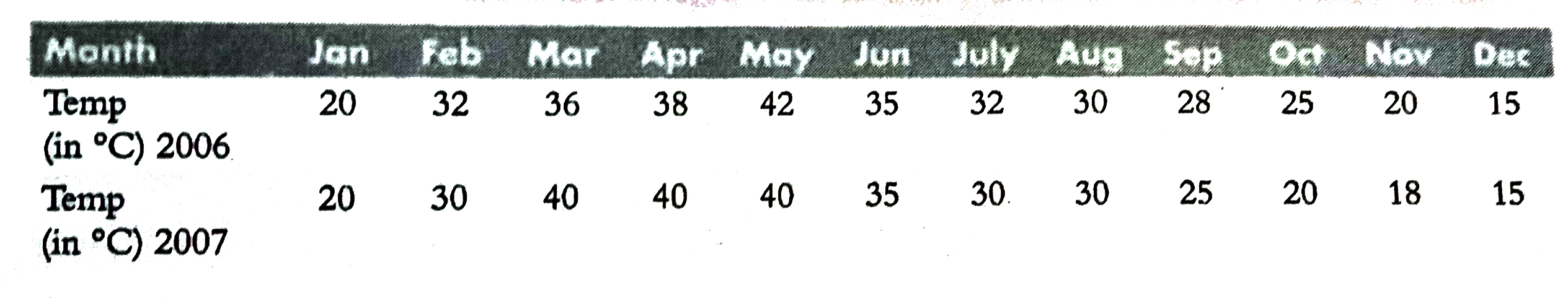
- The following table gives the average temperatures, during the year 20...
Text Solution
|
- In a pie chart, the central angles of two components A and B are 108^(...
Text Solution
|