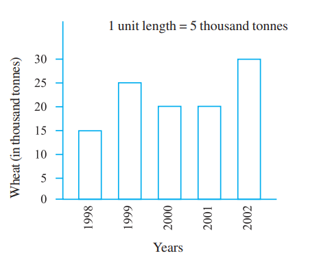
The bar graph given alongside shows the amount of wheat purchasedby government during the year 1998-2002. Read the bar graph andwrite down your observations. In which year was(a) the wheat production maximum?(b) the wheat production minimum?
Text Solution
Verified by Experts
After observing the graph, we can conclude that (a) The wheat production was maximum in the year 2002. (b) The wheat production was minimum in the year 1998.
Topper's Solved these Questions
DATA HANDLING
NCERT|Exercise EXERCISE 9.4|4 Videos
DATA HANDLING
NCERT|Exercise EXERCISE 9.1|7 Videos
DATA HANDLING
NCERT|Exercise SOLVED EXAMPLES|9 Videos
BASIC GEOMETRICAL IDEAS
NCERT|Exercise EXERCISE 4.6|4 Videos
DECIMALS
NCERT|Exercise EXERCISE 8.1|10 Videos
Similar Questions
Explore conceptually related problems
The given bar graph shows the amount of wheat purchased by government during the year 1998-2002. Read the bar graph and write down your observations. In which year was the wheat production maximum ?
The given bar graph shows the amount of wheat purchased by government during the year 1998-2002. Read the bar graph and write down your observations. In which year was the wheat production minimum ?
Read the bar graph given below and answer the following questions: In which year is the number of students maximum?
The Bar graph given below presents the production of wheat (in tonnes) by a big farm during the years 2011-2018. In how many of the given years was the production of wheat greater than the average production of the period?
Read the bar graph given below and answer the following questions: In which year is the number of students twice as that of 2001-02?
In the given years, what is the average production of wheat in Bihar? (in quintals)
Read the following bar graph given in figure and answer the following questions. Which state has minimum production?
Read the bar graph given below Read the bar graph carefully and answer the following questions Q(i) What information is given by the bar graph (ii) In which year was the production maximum (iii) After which year was there a sudden fall in the production (iv) Find the ratio between the maximum production and the minimum production during the given period
The bar graph given below shows the wheat production (in tonnes) of a large farm during the year 2011-2018. In how many years was wheat production higher than the average production of the period? नीचे दिए गए दंड आरेख में वर्ष 2011-2018 के दौरान किसी बड़े फार्म के गेहूं उत्पादन (टन में) को दर्शाया गया है | अवधि के औसत उत्पादन की तुलना में दिए गए कितने वर्षो में गेहूं उत्पादन अधिक था ?