A
B
C
D
Text Solution
Verified by Experts
The correct Answer is:


Similar Questions
Explore conceptually related problems
Recommended Questions
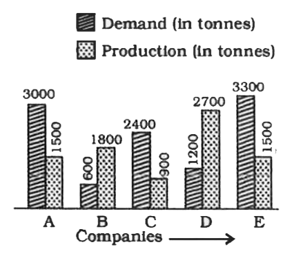
- The following graph shows the demand and production of cotton by 5 com...
Text Solution
|
- Study the bar diagram and answer the following questions Demand and pr...
Text Solution
|
- निर्देश :- दिए गए ग्राफ में विभिन्न कंपनियों के मांग तथा उत्पादन को दर...
Text Solution
|
- What is the ratio of the number of companies having more demand than p...
Text Solution
|
- The following graph shows the demand and production of cotton by 5 com...
Text Solution
|
- The following graph shows the demand and production of cotton by 5 com...
Text Solution
|
- The following graph shows the demand and production of cotton by 5 com...
Text Solution
|
- The following graph shows the demand and production of cotton by 5 com...
Text Solution
|
- दिया गया दंड आरेख (बार ग्राफ) पांच कंपनियों द्वारा मोटेसाइकिलो की मांग...
Text Solution
|