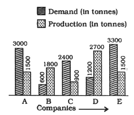
A
B
C
D
Text Solution
Verified by Experts
The correct Answer is:
Similar Questions
Explore conceptually related problems
Recommended Questions
- The following graph shows the demand and production of cotton by 5 com...
Text Solution
|
- The inequation that best describes the following graph is <img src="h...
Text Solution
|
- What is the difference between average demand and average production o...
Text Solution
|
- The following graph shows the demand and production of cotton by 5 com...
Text Solution
|
- The following graph shows the demand and production of cotton by 5 com...
Text Solution
|
- The following graph shows the demand and production of cotton by 5 com...
Text Solution
|
- The following graph shows the demand and production of cotton by 5 com...
Text Solution
|
- The given bar graph Presents the Demand and Production of motorcycle o...
Text Solution
|
- दिया गया दंड आरेख (बार ग्राफ) पांच कंपनियों द्वारा मोटेसाइकिलो की मांग...
Text Solution
|
