


Similar Questions
Explore conceptually related problems
Recommended Questions
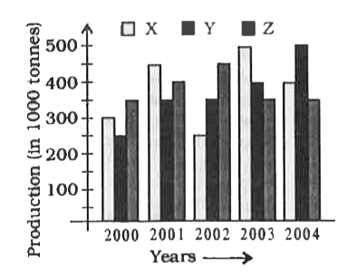
- The following graph shows the production of wheat flour (in 1000 tonne...
Text Solution
|
- The inequation represented by the graph given below is : <img src="htt...
Text Solution
|
- The inequation that best describes the graph given below is <img src=...
Text Solution
|
- The inequation that best describes the following graph is <img src="h...
Text Solution
|
- The following graph shows the production of wheat flour (in 1000 tonne...
Text Solution
|
- The following graph shows the production of wheat flour (in 1000 tonne...
Text Solution
|
- The following graph shows the production of wheat flour (in 1000 tonne...
Text Solution
|
- The following graph shows the production of wheat flour (in 1000 tonne...
Text Solution
|
- The bar graph provided below gives the data of the production of paper...
Text Solution
|