


Similar Questions
Explore conceptually related problems
Recommended Questions
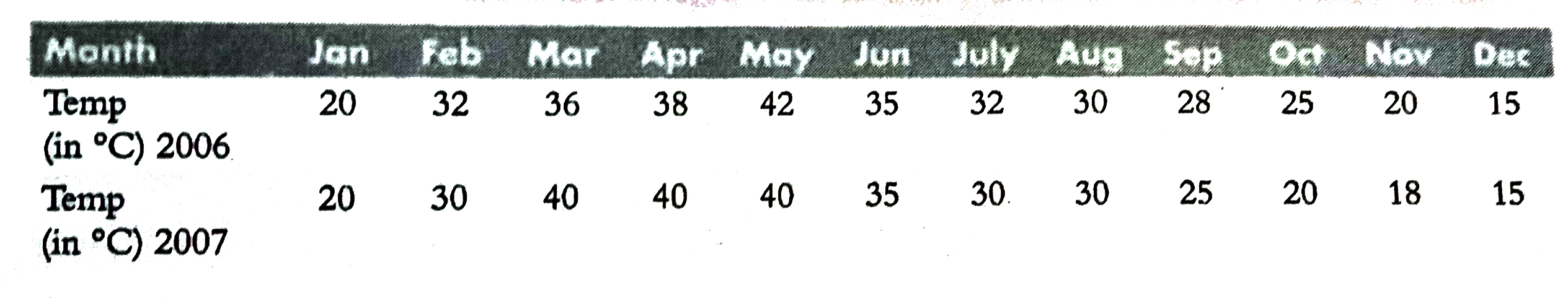
- The following table gives the average temperatures, during the year 20...
Text Solution
|
- The following table gives the average temperatures, during the year 20...
Text Solution
|
- From the following data, using weighted average method, calculate the ...
Text Solution
|
- Which of the following are correct chain isomers of butane ? (i) <img ...
Text Solution
|
- Determine the point of symmetry of a regular hexagon. <img src="htt...
Text Solution
|
- Dtermine the images of the following figure about the given line : ...
Text Solution
|
- Draw the bisector of angleAOB=58^(@) ltimg src="https://d10lpgp6xz60...
Text Solution
|
- Match the following Column A to Column B
Text Solution
|
- Match the following Column A to Column B
Text Solution
|