


Topper's Solved these Questions
Similar Questions
Explore conceptually related problems
ASHOK PUBLICATION ASSAM-Introduction to Graphs-EXAMPLE
- What was the temperature at 1.30 p.m.? How did you arrive at your answ...
Text Solution
|
- During which periods did the patient's temperature showed an upward tr...
Text Solution
|
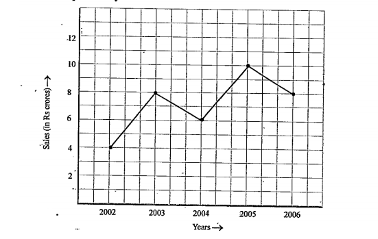
- The following line graph shows the yearly sales figures for a manufact...
Text Solution
|
- The following line graph shows the yearly sales figures for a manufact...
Text Solution
|
- The following line graph shows the yearly sales figures for a manufact...
Text Solution
|
- The following line graph shows the yearly sales figures for a manufact...
Text Solution
|
- For an experiement in Botany, two different plants, plant A and plant ...
Text Solution
|
- For an experiment in Botany, two different plants, plant A and plant B...
Text Solution
|
- For an experiment in Botany, two different plants, plant A and plant B...
Text Solution
|
- For an experiement in Botany, two different plants, plant A and plant ...
Text Solution
|
- For an experiment in Botany, two different plants, plant A and plant B...
Text Solution
|
- For an experiement in Botany, two different plants, plant A and plant ...
Text Solution
|
- For an experiment in Botany, two different plants, plant A and plant B...
Text Solution
|
- The following graph shows the temperature forecast and the actual temp...
Text Solution
|
- The following graph shows the temperature forecast and the actual temp...
Text Solution
|
- The following graph shows the temperature forecast and the actual temp...
Text Solution
|
- The following graph shows the temperature forecast and the actual temp...
Text Solution
|
- Use the tables below to draw liner graphs. The number of days a hill...
Text Solution
|
- A courier-person cycles from a town to a neighbouring suburban area to...
Text Solution
|
- A courier-person cycles from a town to a neighbouring suburban area to...
Text Solution
|