


Topper's Solved these Questions
Similar Questions
Explore conceptually related problems
ASHOK PUBLICATION ASSAM-Introduction to Graphs-EXAMPLE
- For an experiement in Botany, two different plants, plant A and plant ...
Text Solution
|
- For an experiment in Botany, two different plants, plant A and plant B...
Text Solution
|
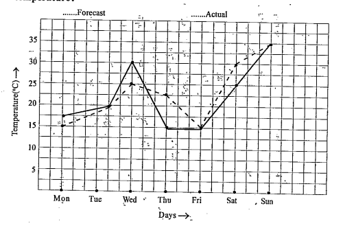
- The following graph shows the temperature forecast and the actual temp...
Text Solution
|
- The following graph shows the temperature forecast and the actual temp...
Text Solution
|
- The following graph shows the temperature forecast and the actual temp...
Text Solution
|
- The following graph shows the temperature forecast and the actual temp...
Text Solution
|
- Use the tables below to draw liner graphs. The number of days a hill...
Text Solution
|
- A courier-person cycles from a town to a neighbouring suburban area to...
Text Solution
|
- A courier-person cycles from a town to a neighbouring suburban area to...
Text Solution
|
- A courier-person cycles from a town to a neighbouring suburban area to...
Text Solution
|
- A courier-person cycles from a town to a neighbouring suburban area to...
Text Solution
|
- A courier-person cycles from a town to a neighbouring suburban area to...
Text Solution
|
- Can there be a time-temperature graph as follows? Justify your answer.
Text Solution
|
- Can there be a time-temperature graph as follows? Justify your answer.
Text Solution
|
- Can there be a time-temperature graph as follows? Justify your answer.
Text Solution
|
- Can there be a time-temperature graph as follows? Justify your answer.
Text Solution
|
- Plot the following points on a graph sheet. Verify if they lie on a li...
Text Solution
|
- Plot the following points on a graph sheet. Verify if they lie on a li...
Text Solution
|
- Plot the following points on a graph sheet. Verify if they lie on a li...
Text Solution
|
- Draw the line passing through (2,3) and (3,2). Find the coordinates of...
Text Solution
|