


Topper's Solved these Questions
Similar Questions
Explore conceptually related problems
PSEB-INTRODUCTION TO GRAPHS-EXAMPLE
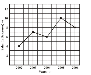
- The following line graph shows the yearly sales figures for a manufact...
Text Solution
|
- Plot the point (4, 3) on a graph sheet. Is it the same as the point (3...
Text Solution
|
- From Fig 15.14, choose the letter(s) that indicate the location of the...
Text Solution
|
- From Fig 15.14, choose the letter(s) that indicate the location of the...
Text Solution
|
- From Fig 15.14, choose the letter(s) that indicate the location of the...
Text Solution
|
- Plot the following points and verify if they lie on a line. If they li...
Text Solution
|
- Plot the following points and verify if they lie on a line. If they li...
Text Solution
|
- Plot the following points and verify if they lie on a line. If they li...
Text Solution
|
- Plot the following points and verify if they lie on a line. If they li...
Text Solution
|
- (Principal and Simple Interest) A bank gives 10% Simple Interest (S.I....
Text Solution
|
- (Principal and Simple Interest) A bank gives 10% Simple Interest (S.I....
Text Solution
|