A
B
C
D
Text Solution
Verified by Experts
The correct Answer is:


Similar Questions
Explore conceptually related problems
Recommended Questions
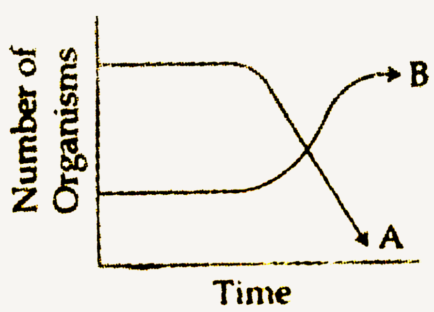
- The following graph depicts changes in two populations (A and B) of he...
Text Solution
|
- The following graph depicts changes in two populations (A and B) of he...
Text Solution
|
- The graph below shows the changes in two populations of herbivores in ...
Text Solution
|
- The following graph depicts changes in two populations (A and B) of he...
Text Solution
|
- Which of the following graphs best depicts the changes in one cycle of...
Text Solution
|
- निम्नलिखित ग्राफ एक घासीय मैदान में शाकाहारियों समष्टियों ( और ) मे...
Text Solution
|
- निम्नलिखत ग्राफ एक घासीय मैदान में शाकाहारयों की दो | समष्टियों (A और ...
Text Solution
|
- The following graph depicts changes in two populations (A and B) of he...
Text Solution
|
- The following graph depicts changes in two populations (A and B) of he...
Text Solution
|