 .............................................................................................................................................
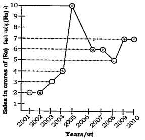
Total sales (in crore of Rs.) from 2005 to 2008 is
.............................................................................................................................................
Total sales (in crore of Rs.) from 2005 to 2008 is A
B
C
D
Text Solution
Verified by Experts


CHAMPION PUBLICATION-2011 TIER-II PAPER(23)-EXERCISE
- The following line diagram represents the yearly sales figure of a com...
Text Solution
|
- The following line diagram represents the yearly sales figure of a com...
Text Solution
|
- The following line diagram represents the yearly sales figure of a com...
Text Solution
|
- The following line diagram represents the yearly sales figure of a com...
Text Solution
|
- The following line diagram represents the yearly sales figure of a com...
Text Solution
|
- The following table shows the number of students of 7 college particip...
Text Solution
|
- The following table shows the number of students of 7 college particip...
Text Solution
|
- The following table shows the number of students of 7 college particip...
Text Solution
|
- The following table shows the number of students of 7 college particip...
Text Solution
|
- The following table shows the number of students of 7 college particip...
Text Solution
|
- The pie-chart provided below gives the distribution of land (in a vill...
Text Solution
|
- The pie-chart provided below gives the distribution of land (in a vill...
Text Solution
|
- The pie-chart provided below gives the distribution of land (in a vill...
Text Solution
|
- The pie-chart provided below gives the distribution of land (in a vill...
Text Solution
|
- The pie-chart provided below gives the distribution of land (in a vill...
Text Solution
|
- The bar graph provided below represents the production of rice and whe...
Text Solution
|
- The bar graph provided below represents the production of rice and whe...
Text Solution
|
- The bar graph provided below represents the production of rice and whe...
Text Solution
|
- The bar graph provided below represents the production of rice and whe...
Text Solution
|
- The bar graph provided below represents the production of rice and whe...
Text Solution
|