


NCERT EXEMPLAR-INTRODUCTION TO GRAPHS -EXERCISE
- Draw the line passing through (2, 3) and (3, 2). Find the coordinat...
Text Solution
|
- The following graph shows the change in temperature of a block of ice ...
Text Solution
|
- The following graph shows the number of people present at a certain sh...
Text Solution
|
- A man started his journey on his car from location A and came back. Th...
Text Solution
|
- The following graph shows the journey made by two cyclists, one from t...
Text Solution
|
- Ajita starts off from home at 07.00 hours with her father on a scooter...
Text Solution
|
- Draw the line graph using suitable scale to show the annual gross prof...
Text Solution
|
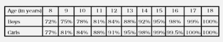
- The following chart gives the growth in height in terms of percentage ...
Text Solution
|
- The table shows the data collected for Dhruv’s walking on a road. ...
Text Solution
|
- Observe the given graph carefully and complete the table given below.
Text Solution
|
- This graph shows the per cent of students who dropped out of school af...
Text Solution
|
- Observe the toothpick pattern given below: (a) Imagine that this ...
Text Solution
|
- Consider this input/output table. (a) Graph the values from the t...
Text Solution
|
- This graph shows a map of an island just off the coast of a continent....
Text Solution
|
- As part of his science project, Prithvi was supposed to record the tem...
Text Solution
|
- The graph given below compares the price (in Rs) and weight of 6 bags ...
Text Solution
|
- The points on the graph below represent the height and weight of the d...
Text Solution
|
- The two graphs below compare Car A and Car B. The left graph shows the...
Text Solution
|
- Sonal and Anmol made a sequence of tile designs from square white tile...
Text Solution
|
- Sonal and Anmol then made another sequence of the designs. Three of th...
Text Solution
|