Home
Class 14
MATHS
The line diagram shows the temperature o...

The line diagram shows the temperature of four Sundays of three cities./ यह रेखा आरेख तीन शहरों में चार रविवार का तापमान दर्शाता है |
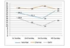
In the given graph, when was the maximum temperature recorded in Delhi?
इसके अनुसार दिल्ली में अधिकतम तापमान कब दर्ज किया गया था ?

A

4th Sunday/चौथा रविवार

B

1st Sunday/ पहला रविवार

C

2nd Sunday/दूसरा रविवार

D

3rd Sunday/तीसरा रविवार

Text Solution

Verified by Experts

Promotional Banner

Topper's Solved these Questions

Similar Questions

Explore conceptually related problems

The line diagram shows the temperature of four Sundays of three cities./ यह रेखा आरेख तीन शहरों में चार रविवार का तापमान दर्शाता है | In the given graph, what was the difference in temperature between Delhi and Mumbai on the 2nd Sunday? / इसके अनुसार दूसरे रविवार को दिल्ली और मुंबई के तापमान में क्या अंतर था ?

The line diagram shows the temperature of four Sundays of three cities./ यह रेखा आरेख तीन शहरों में चार रविवार का तापमान दर्शाता है | In the given graph, what was the average temperature on the 3rd sunday in all the cities? / इस आरेख में सभी शहरों में तीसरे रविवार का औसत तापमान क्या था ?

The line graph shows the temperature on four Sundays of three cities. In the given line graph, when was the maximum temperature recorded in Delhi?

The line graph shows the temperature on four Sundays of three cities. In the given line graph, when was the maximum temperature recorded in Delhi?

The line graph shows the temperature on four sundays of three cities In the given graph when was the maximum temperature recorded in delhi

The line graph shows the temperature on four Sundays of three cities. In the given line graph, what was the difference in temperature between Delhi and Mumbai on the 2^(nd) Sunday ?

The line graph shows the temperature on four sundays of three cities In the given line graph what was the difference in temperature between Delhi and Mumbai on the 2nd Sunday?

The line graph shows the temperature on four Sundays of three cities. In the given line graph. what was the difference in temperature between Delhi and Chennai on the 3^(rd) Sunday?

The line graph shows the temperature on four Sunday of three cities In the given graph, what was the difference in temperature between Delhi and Chennai on the 3rd Sunday?

The line graph shows the temperature on four Sundays of three cities In the given line graph , when was the maximum temperature recorded in Chennai

PINNACLE-DATA INTERPRETATION-EXERCISE
  1. The given bar graph presents the number of different types of vehicles...

    Text Solution

    |

  2. The line diagram shows the temperature of four Sundays of three cities...

    Text Solution

    |

  3. The line diagram shows the temperature of four Sundays of three cities...

    Text Solution

    |

  4. The line diagram shows the temperature of four Sundays of three cities...

    Text Solution

    |

  5. The given pie chart shows runs scored by A in 6 matches. दिया गया पा...

    Text Solution

    |

  6. The given pie chart shows runs scored by A in 6 matches. दिया गया पा...

    Text Solution

    |

  7. The given pie chart shows runs scored by A in 6 matches. दिया गया पा...

    Text Solution

    |

  8. The given bar graph shows the number of marks scored by a student in e...

    Text Solution

    |

  9. The given bar graph shows the number of marks scored by a student in e...

    Text Solution

    |

  10. The given bar graph shows the number of marks scored by a student in e...

    Text Solution

    |

  11. The given bar chart shows the details of cycle sales by a company betw...

    Text Solution

    |

  12. The given bar chart shows the details of cycle sales by a company betw...

    Text Solution

    |

  13. The given bar chart shows the details of cycle sales by a company betw...

    Text Solution

    |

  14. The line graph shows the production of product A and B (in thousands) ...

    Text Solution

    |

  15. The line graph shows the production of product A and B (in thousands) ...

    Text Solution

    |

  16. the given pie chart shows the number of tourists for the year 2015, tr...

    Text Solution

    |

  17. The given pie chart shows the number of tourists for the year 2015, tr...

    Text Solution

    |

  18. The given pie chart shows the number of tourists for the year 2015 tra...

    Text Solution

    |

  19. The table shows Income and expenditure of a person for 3 years (in tho...

    Text Solution

    |

  20. The table shows Income and expenditure of a person for 3 years (in tho...

    Text Solution

    |