Home
Class 14
MATHS
The given bar chart shows the details of...

The given bar chart shows the details of cycle sales by a company between January and May for years 2017 and 2018.
दिया गया दंड आरेख वर्ष 2017 एवं 2018 में एक कंपनी के द्वारा जनवरी से लेकर मई तक साइकिल बिक्री की जानकारी देता है |
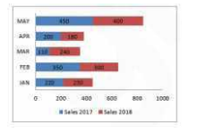
In the given bar-chart, which month sales show the maximum decrease in 2018 as compared to 2017?
दिए गए दंड आरेख में, किस माह की बिक्री 2017 की तुलना में 2018 में अधिकतम कमी को दर्शाती है ?

A

May/ मई

B

February/फरवरी

C

April/अप्रैल

D

January/जनवरी

Text Solution

Verified by Experts

Promotional Banner

Topper's Solved these Questions

Similar Questions

Explore conceptually related problems

The given bar chart shows the details of cycle sales by a company between January and May for years 2017 and 2018. दिया गया दंड आरेख वर्ष 2017 एवं 2018 में एक कंपनी के द्वारा जनवरी से लेकर मई तक साइकिल बिक्री की जानकारी देता है | In the given bar-chart, which month sale shows the maximum increase in 2018 as against 2017? / दिए गए दंड आरेख के नुसार किस महीने की बिक्री 2017 की तुलना में 2018 में अधिकतम वृद्धि दर्शाती है ?

The given bar chart shows the details of cycle sales by a company between january and May for years 2017 and 2018 In the given bar chart, which month sales show the maximum decrease in 2018?

The given bar chart shows the details of cycle sales by a company between January and May for years 2017 and 2018. In the given bar-chart, what is the total increase or decrease in percentage sale in 2018?

The given bar chart shows the details of cycle sales by a company between january and May for years 2017 and 2018 In the given bar chart, which month sales show the maximum decrease in 2018 as compared to 2017

The given bar graph shows the sale of books (in thousands) in four metropolitan branches of a company for the year 2014 and 2015. दिया गया बार ग्राफ वर्ष 2014 और 2015 के लिए किसी कंपनी की चार महानगरीय शाखाओं में पुस्तकों की (हज़ारो में ) बिक्री को दर्शाता है | In the given bar graph, compared to 2014, which of the branch saw maximum increase in sales (in%) in 2015? दिए गए बार ग्राफ में, 2014 की तुलना में 2015में कौन सी शाखा की बिक्री में अधिकतम वृद्धि (% में ) हुई ?

The given bar graph shows the number of marks scored by a student in each subject in three years. दिया गया दंड आरेख एक छात्र के द्वारा तीन वर्षो में प्रत्येक विषय में लाये गए अंकों को दर्शाता है | In the given chart, what is the percentage increase in marks in Mathematics in 2012 compared to 2008 (round off) ? / इस आरेख में वर्ष 2008 की तुलना में वर्ष 2012 में गणित के अंकों में कितने प्रतिशत की वृद्धि हुई है ?

The given Bar Graph presents Income and Expenditure (in crores of Rupees) of a company for the five years, 2014 to 2018. दिया गया दंड आरेख पांच वर्षों अर्थात 2014 से 2018 तक एक कंपनी के आय एवं व्यय ( करोड़ रुपये में ) को दर्शाता है | In which year is the Expenditure more than 40% as compared to the Expenditure in the previous year? किस वर्ष में व्यय पिछले वर्ष के व्यय की तुलना में 40% अधिक है ?

The given Bar Graph presents Income and Expenditure (in crores of Rupees) of a company for the five years, 2014 to 2018. दिया गया दंड आरेख पांच वर्षों अर्थात 2014 से 2018 तक एक कंपनी के आय एवं व्यय ( करोड़ रुपये में ) को दर्शाता है | What is the ratio of the total revenue of the company in 2015 and 2018 to that of its expenditure in 2014 and 2018? 2015 तथा 2018 में कंपनी की कुल आय और 2014 तथा 2018 में कंपनी के कुल व्यय में क्या अनुपात है ?

The given bar graph shows the number of marks scored by a student in each subject in three years. दिया गया दंड आरेख एक छात्र के द्वारा तीन वर्षो में प्रत्येक विषय में लाये गए अंकों को दर्शाता है | In the given chart, in which subject was the lowest marks scored in 2010? इस दंड आरेख के अनुसार वर्ष 2010 में किस विषय में सबसे कम अंक आये थे?

PINNACLE-DATA INTERPRETATION-EXERCISE
  1. The given bar graph shows the number of marks scored by a student in e...

    Text Solution

    |

  2. The given bar graph shows the number of marks scored by a student in e...

    Text Solution

    |

  3. The given bar chart shows the details of cycle sales by a company betw...

    Text Solution

    |

  4. The given bar chart shows the details of cycle sales by a company betw...

    Text Solution

    |

  5. The given bar chart shows the details of cycle sales by a company betw...

    Text Solution

    |

  6. The line graph shows the production of product A and B (in thousands) ...

    Text Solution

    |

  7. The line graph shows the production of product A and B (in thousands) ...

    Text Solution

    |

  8. the given pie chart shows the number of tourists for the year 2015, tr...

    Text Solution

    |

  9. The given pie chart shows the number of tourists for the year 2015, tr...

    Text Solution

    |

  10. The given pie chart shows the number of tourists for the year 2015 tra...

    Text Solution

    |

  11. The table shows Income and expenditure of a person for 3 years (in tho...

    Text Solution

    |

  12. The table shows Income and expenditure of a person for 3 years (in tho...

    Text Solution

    |

  13. The table shows Income and expenditure of a person for 3 years (in tho...

    Text Solution

    |

  14. The bar graph shows the exports of Cars of Type A and B (in Rs million...

    Text Solution

    |

  15. What is the ratio of the total exports of cars of type A in 2014 and 2...

    Text Solution

    |

  16. The bar graph shows the exports of Cars of Type A and B (in Rs million...

    Text Solution

    |

  17. Study the graph and answer the question that follows. आरेख का अध्ययन...

    Text Solution

    |

  18. The given pie chart shows the breakup of total number of the employees...

    Text Solution

    |

  19. The given pie chart shows the breakup of total number of the employees...

    Text Solution

    |

  20. The given pie chart shows the breakup of total number of the employees...

    Text Solution

    |