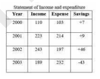
 In the given table, if a person invested his savings every year at 8% simple interest, how much
interest will be earned at the end of 2003?
In the given table, if a person invested his savings every year at 8% simple interest, how much
interest will be earned at the end of 2003? A
B
C
D
Text Solution
Verified by Experts


PINNACLE-DATA INTERPRETATION-EXERCISE
- The given pie chart shows the number of tourists for the year 2015, tr...
Text Solution
|
- The given pie chart shows the number of tourists for the year 2015 tra...
Text Solution
|
- The table shows Income and expenditure of a person for 3 years (in tho...
Text Solution
|
- The table shows Income and expenditure of a person for 3 years (in tho...
Text Solution
|
- The table shows Income and expenditure of a person for 3 years (in tho...
Text Solution
|
- The bar graph shows the exports of Cars of Type A and B (in Rs million...
Text Solution
|
- What is the ratio of the total exports of cars of type A in 2014 and 2...
Text Solution
|
- The bar graph shows the exports of Cars of Type A and B (in Rs million...
Text Solution
|
- Study the graph and answer the question that follows. आरेख का अध्ययन...
Text Solution
|
- The given pie chart shows the breakup of total number of the employees...
Text Solution
|
- The given pie chart shows the breakup of total number of the employees...
Text Solution
|
- The given pie chart shows the breakup of total number of the employees...
Text Solution
|
- The given pie chart shows the quantity wise sales distribution of five...
Text Solution
|
- The given pie chart shows the quantity wise sales distribution of five...
Text Solution
|
- The given pie chart shows the quantity wise sales distribution of five...
Text Solution
|
- The total imports of steel in 2014, 2016 and 2017 is what percent less...
Text Solution
|
- The given bar graph shows the imports and exports (in Rs crores) of st...
Text Solution
|
- The given bar graph shows the imports and exports (in Rs crores) of st...
Text Solution
|
- The given graph shows the marks obtained by students in an examination...
Text Solution
|
- The given graph shows the weights of students in a school on a particu...
Text Solution
|