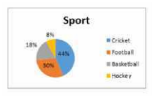
 In the given pie-chart, if the school strength was 2500, how many liked cricket more than hockey?
 A
B
C
D
Text Solution
Verified by Experts


PINNACLE-DATA INTERPRETATION-EXERCISE
- The given pie-chart favourite sport of students of a school. दिया गय...
Text Solution
|
- The table below shows the admission and transfer in standards 1-3 of a...
Text Solution
|
- The given pie-chart favourite sport of students of a school. दिया गय...
Text Solution
|
- The table below shows the admission and transfer in standards 1-3 of a...
Text Solution
|
- The given bar chart shows the sales of books in four metro branches of...
Text Solution
|
- The given bar graph shows the sale of books (in thousands) in four met...
Text Solution
|
- The given pie chart shows the expenditure given in millions on each ga...
Text Solution
|
- The line graph shows the monthly expenditure by two families in hundre...
Text Solution
|
- The graph below shows two families. monthly expenditure (in hundreds) ...
Text Solution
|
- The given pie chart depicts the expenditure incurred in crores towards...
Text Solution
|
- The line graph shows the monthly expenditure by two families in hundre...
Text Solution
|
- The given bar chart shows the sales of books in four metro branches of...
Text Solution
|
- The given pie chart depicts the expenditure incured in crores towards ...
Text Solution
|
- The given bar chart shows population of 4 different states in 3 years ...
Text Solution
|
- The given bar chart shows population of 4 different states in 3 years ...
Text Solution
|
- The given pie chart shows the taxable income for A B C and D in lakhs ...
Text Solution
|
- The line graph shows the temperature on four Sundays of three cities ...
Text Solution
|
- The line graph shows the temperature on four Sundays of three cities ...
Text Solution
|
- The line graph shows the temperature on four Sunday of three cities ...
Text Solution
|
- The given pie chart shows the taxable income for A,B , C and D in lakh...
Text Solution
|