Home
Class 14
MATHS
The graph below shows two families. mont...

The graph below shows two families. monthly expenditure (in hundreds)
नीचे दिया गया ग्राफ दो परिवारों के मासिक व्यय (सेकेंड में) को दर्शाता है
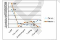
In the given graph, what is the ratio of the difference between food and education for families J and K ?
दिए गए ग्राफ में, परिवार J और K के लिए भोजन तथा शिक्षा के बीच के व्यय में अंतर का अनुपात क्या है ?

A

`9:2`

B

`13:25`

C

`31:36`

D

`21:34`

Text Solution

Verified by Experts

Promotional Banner

Topper's Solved these Questions

Similar Questions

Explore conceptually related problems

The line graph shows the monthly expenditure by two families in hundreds IN the given line graph, what is the ratio of the difference in spending between food and education for family J and k?

The given pie chart shows the expenditure given in millions on each game. दिया गया पाई चार्ट प्रत्येक खेल पर करोड़ो में दिए गए व्यय को दर्शाता है | In the given pie chart, what is the difference between expenditure on cricket and football ? दिए गए पाई चार्ट में , क्रिकेट और फुटबॉल पर किये गए व्यय के बीच क्या अंतर है ?

The table shows Income and expenditure of a person for 3 years (in thousands) यह तालिका 3 वर्षों के दौरान किसी व्यक्ति के आय एवं व्यय (हज़ार में ) को दर्शाती है | In the given table, what is the percentage of expenditure on income in the year 2002? (round off) दी गयी तालिका के अनुसार, वर्ष 2002 में आय पर व्यय का प्रतिशत कया है?

The given Bar Graph presents the number of students of two schools for six years. दिया गया दंड आरेख (बार ग्राफ) छह वर्षो के दौरान दो स्कूलों में विद्यार्थियों की संख्या को दर्शाता है| What is the ratio of the students taken for all years together from school B to that from school A? सभी वर्षों के दौरान स्कूल B और स्कूल A के कुत्र विद्यार्थियों का अनुपात क्या है?

The given bar graph shows the number of students of two schools over a period of six years दिया गया दंड आरेख में छह साल की अवधि में दो स्कूलों के छात्रों की संख्या को दर्शाता है। In the bar graph, in which year is the sum of the students from schools A and B taken together is minimum ? दंड आरेख में, A और B स्कूलों के छात्रों का योग किस वर्ष में न्यूनतम है?

The given Bar Graph presents the number of students of two schools for six years. दिया गया दंड आरेख छः वर्ष की अवधि में दो विद्यालयों में छात्रों की संख्या को दर्शाता है | In which year, the absolute difference between the numbers of students in two schools is the highest? किस वर्ष में, दोनों विद्यालयों में छात्रों की संख्या के बीच पूर्ण अंतर सबसे अधिक है ?

The line graph shows the monthly expenditure by two families in hundreds In the given line graph what is the difference in percentage of percentage of spending on food between family J and K?

The given Bar Graph presents Income and Expenditure (in crores of Rupees) of a company for the five years, 2014 to 2018. दिया गया दंड आरेख पांच वर्षों अर्थात 2014 से 2018 तक एक कंपनी के आय एवं व्यय ( करोड़ रुपये में ) को दर्शाता है | What is the ratio of the total revenue of the company in 2015 and 2018 to that of its expenditure in 2014 and 2018? 2015 तथा 2018 में कंपनी की कुल आय और 2014 तथा 2018 में कंपनी के कुल व्यय में क्या अनुपात है ?

The bar graph given below shows the maximum temperature ( ^@C ) of a city for ten days in different months. नीचे दिया गया दण्ड आरेख किसी शहर के विभिन्न मासों में 10 भिन्न दिनों के अधिकतम तापमान ( ^@C ) को दर्शाता है | What is the average per day maximum temperature of the city for the given period of ten days ? दिए गए दस दिनों के लिए प्रतिदिन शहर का औसत अधिकतम तापमान कितना है ?

The given Bar Graph presents the number of students of two schools for six years. दिया गया दंड आरेख (बार ग्राफ) छह वर्षो के दौरान दो स्कूलों में विद्यार्थियों की संख्या को दर्शाता है| In which year, the absolute difference of the students in two schools is the lowest? किस वर्ष में, दोनो स्कूलों के विद्यार्थियों की संख्या का निरपेक्ष अंतर सबसे कम है?

PINNACLE-DATA INTERPRETATION-EXERCISE
  1. The given pie chart shows the expenditure given in millions on each ga...

    Text Solution

    |

  2. The line graph shows the monthly expenditure by two families in hundre...

    Text Solution

    |

  3. The graph below shows two families. monthly expenditure (in hundreds) ...

    Text Solution

    |

  4. The given pie chart depicts the expenditure incurred in crores towards...

    Text Solution

    |

  5. The line graph shows the monthly expenditure by two families in hundre...

    Text Solution

    |

  6. The given bar chart shows the sales of books in four metro branches of...

    Text Solution

    |

  7. The given pie chart depicts the expenditure incured in crores towards ...

    Text Solution

    |

  8. The given bar chart shows population of 4 different states in 3 years ...

    Text Solution

    |

  9. The given bar chart shows population of 4 different states in 3 years ...

    Text Solution

    |

  10. The given pie chart shows the taxable income for A B C and D in lakhs ...

    Text Solution

    |

  11. The line graph shows the temperature on four Sundays of three cities ...

    Text Solution

    |

  12. The line graph shows the temperature on four Sundays of three cities ...

    Text Solution

    |

  13. The line graph shows the temperature on four Sunday of three cities ...

    Text Solution

    |

  14. The given pie chart shows the taxable income for A,B , C and D in lakh...

    Text Solution

    |

  15. The given bar chard shows population of 4 different states in 3 years ...

    Text Solution

    |

  16. The given pie chart shows the taxable income for A , B , C and D in la...

    Text Solution

    |

  17. The table given below presents the number of books on different subjec...

    Text Solution

    |

  18. The table given below presents the number of books on different subjec...

    Text Solution

    |

  19. The table given below presents the number of books on different subjec...

    Text Solution

    |

  20. The pie-chart given below shows the number of laptops in an office pro...

    Text Solution

    |