Home
Class 14
MATHS
The given bar chard shows population of ...

The given bar chard shows population of 4 different states in 3 years

IN the given bar chart which state has had the maximum population growth in 2015 compared to 2005?

A

Bihar /बिहार

B

Tamilnadu / तमिलनाडु

C

Aassam / असम

D

Kerla / केरल

Text Solution

Verified by Experts

Promotional Banner

Topper's Solved these Questions

Similar Questions

Explore conceptually related problems

The given bar chart shows population of 4 different states in 3 years (in crores). In the given bar-chart. which state has had the maximum population growth in 2015 compared to 2005.

The given bar chart shows population of 4 different states in 3 years In the given bar chart, what is the population growth in total in states kerala and tamil nadu for the period between 2005 and 2015?

The given bar chart shows population of 4 different states in 3 years (in crores). In the given bar-chart, what is the population growth (in crores) in total in states Kerala and Tamil Nadu for the period between 2005 and 2015?

The given bar chart shows population of 4 different states in 3 years In the given bar chart, what is the ratio of increase in population in Bihar between 2005 and 2010 to that between 2010 and 2015

The given bar chart shows population of 4 different states in 3 years (in crores). In the given bar-chart, what is the ratio of increase in population in Bihar between 2005 and 2010 to that between 2010 and 2015?

The given bar chart production of steel by companies A , B, c and D for years 2014 ,2015, 2016 In the given bar chart which company has the maximum total production of steel

The given bar chart shows number of marks scored by a student in each subject in three years In the given bar chart, in which subject was the lowest marks scored in 2010

The given bar chart shows production of steel by companies A, B, C and D for years 2014, 2015, 2016 (in tonnes). In the given bar-chart, which company has the maximum total production of steel?

The given bar chart shows the details of cycle sales by a company between january and May for years 2017 and 2018 In the given bar chart, which month sales show the maximum decrease in 2018 as compared to 2017

PINNACLE-DATA INTERPRETATION-EXERCISE
  1. The line graph shows the temperature on four Sunday of three cities ...

    Text Solution

    |

  2. The given pie chart shows the taxable income for A,B , C and D in lakh...

    Text Solution

    |

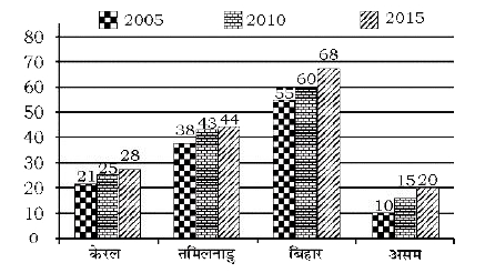
  3. The given bar chard shows population of 4 different states in 3 years ...

    Text Solution

    |

  4. The given pie chart shows the taxable income for A , B , C and D in la...

    Text Solution

    |

  5. The table given below presents the number of books on different subjec...

    Text Solution

    |

  6. The table given below presents the number of books on different subjec...

    Text Solution

    |

  7. The table given below presents the number of books on different subjec...

    Text Solution

    |

  8. The pie-chart given below shows the number of laptops in an office pro...

    Text Solution

    |

  9. The pie-chart given below shows the number of laptops in an office pro...

    Text Solution

    |

  10. The pie-chart given below shows the number of laptops in an office pro...

    Text Solution

    |

  11. The bar graph given below presents the marks (out of 100) obtained by ...

    Text Solution

    |

  12. The bar graph given below presents the marks (out of 100) obtained by ...

    Text Solution

    |

  13. The bar graph given below presents the marks (out of 100) obtained by ...

    Text Solution

    |

  14. The Table given below presents the marks obtained by three students in...

    Text Solution

    |

  15. The Table given below presents the marks obtained by three students in...

    Text Solution

    |

  16. The Table given below presents the marks obtained by three students in...

    Text Solution

    |

  17. The bar graph given below shows the maximum temperature (^@C) of a cit...

    Text Solution

    |

  18. The bar graph given below shows the maximum temperature (^@C) of a cit...

    Text Solution

    |

  19. The bar graph given below shows the maximum temperature (^@C) of a cit...

    Text Solution

    |

  20. The bar graph given below shows the number of cars parked in a parking...

    Text Solution

    |