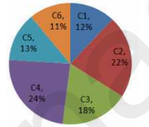
 If the total number of laptops in office is 3800, then find the difference between the laptops of
company C2 and C5 ?
If the total number of laptops in office is 3800, then find the difference between the laptops of
company C2 and C5 ? A
B
C
D
Text Solution
Verified by Experts


PINNACLE-DATA INTERPRETATION-EXERCISE
- The pie-chart given below shows the number of laptops in an office pro...
Text Solution
|
- The pie-chart given below shows the number of laptops in an office pro...
Text Solution
|
- The pie-chart given below shows the number of laptops in an office pro...
Text Solution
|
- The bar graph given below presents the marks (out of 100) obtained by ...
Text Solution
|
- The bar graph given below presents the marks (out of 100) obtained by ...
Text Solution
|
- The bar graph given below presents the marks (out of 100) obtained by ...
Text Solution
|
- The Table given below presents the marks obtained by three students in...
Text Solution
|
- The Table given below presents the marks obtained by three students in...
Text Solution
|
- The Table given below presents the marks obtained by three students in...
Text Solution
|
- The bar graph given below shows the maximum temperature (^@C) of a cit...
Text Solution
|
- The bar graph given below shows the maximum temperature (^@C) of a cit...
Text Solution
|
- The bar graph given below shows the maximum temperature (^@C) of a cit...
Text Solution
|
- The bar graph given below shows the number of cars parked in a parking...
Text Solution
|
- The bar graph given below shows the number of cars parked in a parking...
Text Solution
|
- The bar graph given below shows the number of cars parked in a parking...
Text Solution
|
- The bar graph given below shows the number of men and women working in...
Text Solution
|
- The bar graph given below shows the number of men and women working in...
Text Solution
|
- The bar graph given below shows the number of men and women working in...
Text Solution
|
- The pie chart given below presents the percentage of the number of mot...
Text Solution
|
- The pie chart given below presents the percentage of the number of mot...
Text Solution
|