 In which year the profit of two companies, taken together, is maximum:
 A
B
C
D
Text Solution
Verified by Experts
The correct Answer is:


PINNACLE-DATA INTERPRETATION-EXERCISE
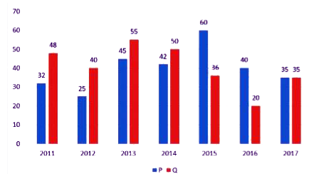
- The Bar Graph shows the Profit (Rupees in Lakhs) earned by two compani...
Text Solution
|
- The Bar Graph shows the Profit (Rupees in Lakhs) earned by two compani...
Text Solution
|
- The Bar Graph shows the Profit (Rupees in Lakhs) earned by two compani...
Text Solution
|
- The given bar graph shows the production and sale of mobile handsets o...
Text Solution
|
- Identify A,B,C,D and E in the given diagram of arrangement of teeth
Text Solution
|
- The given bar graph shows the production and sale of mobile handsets o...
Text Solution
|
- The table shows the number of candidates appearing in the interview fo...
Text Solution
|
- The table shows the number of candidates appearing in the interview fo...
Text Solution
|
- The table shows the number of candidates appearing in the interview fo...
Text Solution
|
- The Table shows the Number of Laptops and Desktops manufactured by a c...
Text Solution
|
- The Table shows the Number of Laptops and Desktops manufactured by a c...
Text Solution
|
- The Table shows the Number of Laptops and Desktops manufactured by a c...
Text Solution
|
- The Table shows the number of articles sold by six different sellers (...
Text Solution
|
- The Table shows the number of articles sold by six different sellers (...
Text Solution
|
- The Table shows the number of articles sold by six different sellers (...
Text Solution
|
- The Table shows the distribution of the marks obtained by various stud...
Text Solution
|
- The Pie chart shows the proportionate population of seven villages. Th...
Text Solution
|
- The bar chart shows the annual food grain production (in million tonne...
Text Solution
|
- The Pie Chart shows the angular representation of five different Emplo...
Text Solution
|
- The Pie Chart shows the angular representation of five different Emplo...
Text Solution
|