A
B
C
D
Text Solution
Verified by Experts


PINNACLE-DATA INTERPRETATION-EXERCISE
- The Table shows the distribution of the marks obtained by various stud...
Text Solution
|
- The Pie chart shows the proportionate population of seven villages. Th...
Text Solution
|
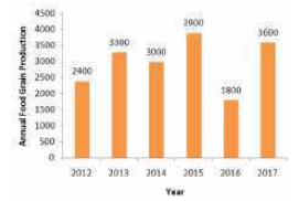
- The bar chart shows the annual food grain production (in million tonne...
Text Solution
|
- The Pie Chart shows the angular representation of five different Emplo...
Text Solution
|
- The Pie Chart shows the angular representation of five different Emplo...
Text Solution
|
- The Pie Chart shows the angular representation of five different Emplo...
Text Solution
|
- The Table given below presents the annual expenses (in thousands) on v...
Text Solution
|
- The Bar graph given below presents the runs scored by eleven cricketer...
Text Solution
|
- What is a density bottle?
Text Solution
|
- The pie-chart specifically shows the allocation of revenue for the exp...
Text Solution
|
- The following pie-chart shows the market share of exporting countries....
Text Solution
|
- The following bar graph shows the quantity (in million) of grains expo...
Text Solution
|
- The bar graph given below shows the wheat production (in tonnes) of a ...
Text Solution
|
- The bar graph given below shows the profit (in multiples of thousand r...
Text Solution
|
- The Table presents the amount of milk (in litres) sold by two milkmen ...
Text Solution
|
- The Table presents the amount of milk (in litres) sold by two milkmen ...
Text Solution
|
- The Table presents the amount of milk (in litres) sold by two milkmen ...
Text Solution
|
- The pie-chart given below shows the number of laptops in an office pro...
Text Solution
|
- The pie-chart given below shows the expenses incurred by various depar...
Text Solution
|
- The pie-chart given below shows the expenses incurred by various depar...
Text Solution
|