A
B
C
D
Text Solution
Verified by Experts


PINNACLE-DATA INTERPRETATION-EXERCISE
- The following bar graph shows the quantity (in million) of grains expo...
Text Solution
|
- The bar graph given below shows the wheat production (in tonnes) of a ...
Text Solution
|
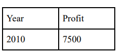
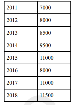
- The bar graph given below shows the profit (in multiples of thousand r...
Text Solution
|
- The Table presents the amount of milk (in litres) sold by two milkmen ...
Text Solution
|
- The Table presents the amount of milk (in litres) sold by two milkmen ...
Text Solution
|
- The Table presents the amount of milk (in litres) sold by two milkmen ...
Text Solution
|
- The pie-chart given below shows the number of laptops in an office pro...
Text Solution
|
- The pie-chart given below shows the expenses incurred by various depar...
Text Solution
|
- The pie-chart given below shows the expenses incurred by various depar...
Text Solution
|
- The given Bar Graph presents the Export of Tea and Coffee (in million ...
Text Solution
|
- The given Bar Graph presents the Export of Tea and Coffee (in million ...
Text Solution
|
- The given Bar Graph presents the Export of Tea and Coffee (in million ...
Text Solution
|
- The given Bar Graph presents Income and Expenditure (in crores of Rupe...
Text Solution
|
- The table given below shows the number of units of a product produced ...
Text Solution
|
- The table given below shows the number of units of a product produced ...
Text Solution
|
- The table given below shows the number of units of a product produced ...
Text Solution
|
- The pie-chart below shows the percentage figures of eggs consumed in t...
Text Solution
|
- The Pie-chart given below shows the figures of various heads of expend...
Text Solution
|
- The Pie chart given below presents the figures of different heads of e...
Text Solution
|
- The Pie-chart given here shows the percentage of candidates selected i...
Text Solution
|