Home
Class 14
MATHS
The given Bar Graph presents Income and ...

The given Bar Graph presents Income and Expenditure (in crores of Rupees) of a company for five years, 2014 to 2018. What is the ratio of total Expenditure to total Income of the company in 2014,2016 and 2017? दिया गया दंड आरेख (बार ग्राफ) 5 वर्षों, 2014 से 2018 के दौरान किसी कंपनी की आय और व्यय (करोड़ रुपए में) को दर्शाता है| 2014, 2016 और 2017 में कंपनी के कुल व्यय और कुल आय का अनुपात क्या है?

A

50

B

45

C

48

D

42

Text Solution

Verified by Experts

Promotional Banner

Topper's Solved these Questions

Similar Questions

Explore conceptually related problems

The given Bar Graph presents Income and Expenditure (in crores of Rupees) of a company for five years, 2014 to 2018. The total Income of the company in 2015, 2017 and 2018 is approximately what percent less than the total Expenditure in the five years? दिया गया दंड आरेख (बार ग्राफ) 5 वर्षो, 2014 से 2018 के दौरान किसी कंपनी की आय और व्यय (करोड़ रुपए में) को दर्शाता है 2015, 201 और 2018 में कंपनी की कुल आय, 5 वर्षो में कुल व्यय से लगभग कितने प्रतिशत कम है?

The given Bar Graph presents Income and Expenditure (in crores of Rupees) of a company for five years, 2014 to 2018. In which year is the Expenditure more than 40% as compared to the Expenditure in the previous year? दिया गया दंड आरेख (बार ग्राफ) 5 वर्षो, 2014 से 2018 के दौरान किसी कंपनी की आय और व्यय (करोड़ रुपए में) को दर्शाता है| पिछले वर्ष के व्यय की तुलना में किस वर्ष में वह 40% अधिक है?

The given Bar Graph presents Income and Expenditure (in crores of Rupees) of a company for five years, 2014 to 2018. The average Income (per year) of the company in five years is what percentage more than its Expenditure in 2015? दिया गया दंड आरेख॑ (बार ग्राफ) 5 वर्षों, 2014 से 2018 के दौरान किसी कंपनी की आय और व्यय (करोड़ रुपए में) को दर्शाता है| 5 वर्षों में कंपनी की (प्रतिवर्ष) औसत आय 2015 में उसके व्यय से कितने प्रतिशत अधिक है?

The given Bar Graph presents the Revenue and Expenditure (in crores of Rupees ) of a company during the five year period, 2014-2018. What is the ratio of the total revenue of the company in 2015 and 2018 to that of its expenditure in 2014 and 2018 ?

The given Bar Graph presents Income and Expenditure (in crores of Rupees) of a company for the five years, 2014 to 2018. दिया गया दंड आरेख पांच वर्षों अर्थात 2014 से 2018 तक एक कंपनी के आय एवं व्यय ( करोड़ रुपये में ) को दर्शाता है | What is the ratio of total Expenditure to total Income of the company in 2014, 2016 and 2017? 2014, 2016 और 2017 में कंपनी के कुल व्यय और कुल आय में क्या अनुपात है ?

The given Bar Graph presents the Revenue of Expenditure (in crores of rupees) of a company during the five year period, 2014 - 2018. दिया गया दंड आरेख (Bar graph) 5 वर्ष की अवधि 2014-2018 के दौरान किसी कंपनी के राजस्व और व्यय (करोड़ रुपए में) को दर्शाता है| वर्ष 2016 से 2018 तक कंपनी का कुल व्यय, 5 वर्ष की अवधि के कुल राजस्व का कितना प्रतिशत )पूर्णांक के करीब है)? The total expenditure of the company from 2016 - 2018 is what percentage (nearest to an integer) of the total revenue of the five year period?

The given Bar Graph presents the Export of Tea and Coffee (in million kg) for the years 2012 to 2016. What is the ratio of total export of tea in 2012, 2014 and 2015 to the total export of coffee in 2013 and 2014? दिया गया दंड आरेख वर्ष 2012 से 2016 के दौरान चाय और कॉफ़ी के निर्यात ( मिलियन किलो ग्राम में ) को दर्शाता है | 2012, 2014 और 2015 में चाय के कुल निर्यात का 2013 और 2014 में कॉफ़ी के कुल निर्यात के साथ अनुपात ज्ञात करें |

PINNACLE-DATA INTERPRETATION-EXERCISE
  1. The given Bar Graph presents the Export of Tea and Coffee (in million ...

    Text Solution

    |

  2. The given Bar Graph presents the Export of Tea and Coffee (in million ...

    Text Solution

    |

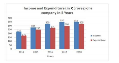
  3. The given Bar Graph presents Income and Expenditure (in crores of Rupe...

    Text Solution

    |

  4. The table given below shows the number of units of a product produced ...

    Text Solution

    |

  5. The table given below shows the number of units of a product produced ...

    Text Solution

    |

  6. The table given below shows the number of units of a product produced ...

    Text Solution

    |

  7. The pie-chart below shows the percentage figures of eggs consumed in t...

    Text Solution

    |

  8. The Pie-chart given below shows the figures of various heads of expend...

    Text Solution

    |

  9. The Pie chart given below presents the figures of different heads of e...

    Text Solution

    |

  10. The Pie-chart given here shows the percentage of candidates selected i...

    Text Solution

    |

  11. The Pie-chart given here shows the percentage of candidates selected i...

    Text Solution

    |

  12. The Pie-chart given here shows the percentage of candidates selected i...

    Text Solution

    |

  13. The table given below shows the number of notes of three different den...

    Text Solution

    |

  14. The table given below shows the number of notes of three different den...

    Text Solution

    |

  15. The table given below shows the number of notes of three different den...

    Text Solution

    |

  16. The bar graph given below shows the target and actual production of ce...

    Text Solution

    |

  17. The bar graph given below shows the target and actual production of ce...

    Text Solution

    |

  18. The bar graph given below shows the target and actual production of ce...

    Text Solution

    |

  19. The table given below presents the figures of the production (in thous...

    Text Solution

    |

  20. The table given below presents the figures of the production (in thous...

    Text Solution

    |