Home
Class 14
MATHS
The Pie-chart given here shows the perce...

The Pie-chart given here shows the percentage of candidates selected in an examination from 2012 to 2016.
यहाँ दिया गया वृत्त आरेख 2012 से 2016 तक किसी परीक्षा में चयनित उम्मीदवारों के प्रतिशत को दर्शाता है |
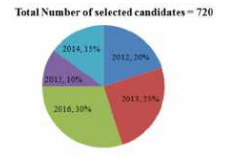
In which year the number of selected candidates is equal to the total number of selected candidates in 2012 and 2015 taken together ?
किस वर्ष में चयनित उम्मीदवारों की संख्या, वर्ष 2012 तथा 2015 को एक साथ मिलाकर चयनित उम्मीदवारों की कुल संख्या के बराबर है ?

A

2014

B

2016

C

2013

D

2012

Text Solution

Verified by Experts

Promotional Banner

Topper's Solved these Questions

Similar Questions

Explore conceptually related problems

The Pie-chart given here shows the percentage of candidates selected in an examination from 2012 to 2016. यहाँ दिया गया वृत्त आरेख 2012 से 2016 तक किसी परीक्षा में चयनित उम्मीदवारों के प्रतिशत को दर्शाता है | What is the total number of selected candidates for the year 2012 and 2014 taken together ? वर्ष 2012 तथा 2014 को मिलाकर, चयनित उम्मीदवारों की कुल संख्या है :

The Pie-chart given here shows the percentage of candidates selected in an examination from 2012 to 2016. यहाँ दिया गया वृत्त आरेख 2012 से 2016 तक किसी परीक्षा में चयनित उम्मीदवारों के प्रतिशत को दर्शाता है | Total candidates selected in 2015 is what percentage less than the total candidates selected in 2013? 2015 में चयनित कुल उम्मीदवार, 2013 में चयनित कुल उम्मीदवारों से कितने प्रतिशत कम है ?

The number of selections of 2 candidate for a post out of 5 equally qualified candidates

In which year maximum number of candidates were selected for the post of A ?

The given bar graph presents the number of students from Science and Arts streams from a school in different years. दिया गया दंड आरेख अलग-अलग वर्षों में एक विद्यालय में विज्ञान एवं कला संकाय के छात्रों की संख्या को दर्शाता है | What is the ratio of the total number of Science students in 2011 and 2015 to that of Arts in 2012 and 2015? 2011 तथा 2015 में विज्ञान के छात्रों की कुल संख्या का 2012 तथा 2015 में कला के छात्रों की कुल संख्या के साथ अनुपात ज्ञात करें |

The table shows the number of candidates appearing in the interview for a post in six banks (H, I, J, K, L, M) and the percentage of candidates found eligible. यह तालिका छह बैंकों (H, I, J, K, L, M) में किसी पद हेतु साक्षात्कार में शामिल होने वाले उम्मीदवारों की संख्या तथा योग्य पाए जाने वाले उम्मीदवारों के प्रतिशत को दर्शाती है | What is the ratio of the number of candidates found eligible in Bank H to the number of candidates found eligible in Bank L ? बैंक H में योग्य पाए गए उम्मीदवारों की संख्या और बैंक L में योग्य पाए गए उम्मीदवारों की संख्या का संबंधित अनुपात कितना था ?

The number of ways of selecting atleast 4 candidates from 8 candidates is:

The given bar graph shows the imports and exports (in Rs crores) of steel by a country from 2013 to 2017. दिया गया दंड आरेख एक देश के द्वारा 2013 से 2017 तक इस्पात के आयात और निर्यात ( करोड़ रुपये में) को दर्शाता है | What is the ratio of the total imports in 2015 and 2017 to the total exports in 2013 and 2016 ? 2015 तथा 2017 में किये गए कुल आयात का 2013 तथा 2016 में किये गए कुल निर्यात के साथ अनुपात ज्ञात करें|

The given Bar Graph presents the results in terms of number of students for the five academic years, 2013-2014 to 2017-2018. दिया गया दंड आरेख पांच शैक्षणिक वर्षों : 2013-2014 से 2017-2018 तक छात्रों की संख्या के संदर्भ में परिणामों को प्रस्तुत करता है | In which year the percentage increase in the total number of students is the highest in comparison to the previous academic year? किस वर्ष कुल छात्रों की संख्या में प्रतिशत वृद्धि पिछले शैक्षणिक वर्ष की तुलना में सर्वाधिक है ?

PINNACLE-DATA INTERPRETATION-EXERCISE
  1. The Pie chart given below presents the figures of different heads of e...

    Text Solution

    |

  2. The Pie-chart given here shows the percentage of candidates selected i...

    Text Solution

    |

  3. The Pie-chart given here shows the percentage of candidates selected i...

    Text Solution

    |

  4. The Pie-chart given here shows the percentage of candidates selected i...

    Text Solution

    |

  5. The table given below shows the number of notes of three different den...

    Text Solution

    |

  6. The table given below shows the number of notes of three different den...

    Text Solution

    |

  7. The table given below shows the number of notes of three different den...

    Text Solution

    |

  8. The bar graph given below shows the target and actual production of ce...

    Text Solution

    |

  9. The bar graph given below shows the target and actual production of ce...

    Text Solution

    |

  10. The bar graph given below shows the target and actual production of ce...

    Text Solution

    |

  11. The table given below presents the figures of the production (in thous...

    Text Solution

    |

  12. The table given below presents the figures of the production (in thous...

    Text Solution

    |

  13. The table given below presents the figures of the production (in thous...

    Text Solution

    |

  14. The given pie Chart (angles are not as per chosen scale) presents the ...

    Text Solution

    |

  15. The given pie Chart (angles are not as per chosen scale) presents the ...

    Text Solution

    |

  16. The given pie Chart (angles are not as per chosen scale) presents the ...

    Text Solution

    |

  17. The given Bar Graph presents the number of different types of vehicles...

    Text Solution

    |

  18. The given Bar Graph presents the number of different types of vehicles...

    Text Solution

    |

  19. The given Bar Graph presents the number of different types of vehicles...

    Text Solution

    |

  20. The following bar graph shows the amount of imports (in million kg) of...

    Text Solution

    |