 The period in which the profit of the company has increased fastest is:
 A
B
C
D
Text Solution
Verified by Experts


PINNACLE-DATA INTERPRETATION-EXERCISE
- As per the data shown in the following table, what is the percentage o...
Text Solution
|
- The given graph shows the pass percentage of students taught by six te...
Text Solution
|
- The following graph given the annual percent profit earned by a compan...
Text Solution
|
- The following graph represents the annual percentage profit earned by ...
Text Solution
|
- The following graph shows the performance in aggregate marks of 2 boar...
Text Solution
|
- The given graph represents the percentage distribution of the total ex...
Text Solution
|
- The given graph represents the percentage distribution of the total ex...
Text Solution
|
- The given graph represents the percentage distribution of the total ex...
Text Solution
|
- The graph represents the salary, expenditure, tax and savings (in rupe...
Text Solution
|
- The above graph represents the salary, expenditure, tax and savings (i...
Text Solution
|
- The graph represents the salary, expenditure, tax and savings (in rupe...
Text Solution
|
- Identify A,B,C,D in the above given figure:-
Text Solution
|
- The percentage of customers of two network operators P and q across th...
Text Solution
|
- the following graph shows the expenditure on education sector by India...
Text Solution
|
- The following graph gives the details of the male and female populatio...
Text Solution
|
- first graph shows the number of students (boys and girls in thousands)...
Text Solution
|
- A home decor company produces five different products - bed sheets, cl...
Text Solution
|
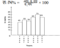
- The given bar graph represents the income and expenditure of a person ...
Text Solution
|
- The given bar graph represents the income and expenditure of a person ...
Text Solution
|
- The given bar graph represents the number of students admitted in four...
Text Solution
|