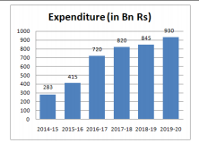
 If the government plans to increase the expenditure by 30% on the average expenditure in 2016-17, 2017-18, 2018-19, then the approximate amount (in billion of rupees) to be spent in 2020-21 is:
 A
B
C
D
Text Solution
Verified by Experts


PINNACLE-DATA INTERPRETATION-EXERCISE
- Identify A,B,C,D in the above given figure:-
Text Solution
|
- The percentage of customers of two network operators P and q across th...
Text Solution
|
- the following graph shows the expenditure on education sector by India...
Text Solution
|
- The following graph gives the details of the male and female populatio...
Text Solution
|
- first graph shows the number of students (boys and girls in thousands)...
Text Solution
|
- A home decor company produces five different products - bed sheets, cl...
Text Solution
|
- The given bar graph represents the income and expenditure of a person ...
Text Solution
|
- The given bar graph represents the income and expenditure of a person ...
Text Solution
|
- The given bar graph represents the number of students admitted in four...
Text Solution
|
- The given bar graph represents the number of students admitted in four...
Text Solution
|
- The given bar graph represents the number of students admitted in four...
Text Solution
|
- The following graph shows the data of the collection of interest on lo...
Text Solution
|
- The given pie chart shows the percentage of students enrolled for the ...
Text Solution
|
- The following bar graph shows the marks (out of 100) of students A, B,...
Text Solution
|
- The following bar graph shows the data of the production of an item (i...
Text Solution
|
- The following graph shows the sales of cars (in thousands) in four cit...
Text Solution
|
- The following graph shows the sales of cars (in thousands) in four cit...
Text Solution
|
- The following graph shows the sales of cars (in thousands) in four cit...
Text Solution
|
- The following graph shows the sales of cars (in thousands) in four cit...
Text Solution
|
- The given graph represents the rainfall (in cm) in a city, over a peri...
Text Solution
|