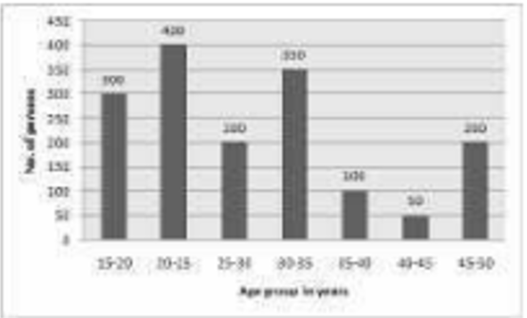
 The ratio of the number of persons in the age groups 15-20 years and 20-25 years together, to
the number of persons in the age group 30-35 years and 35-40 years together, is:
The ratio of the number of persons in the age groups 15-20 years and 20-25 years together, to
the number of persons in the age group 30-35 years and 35-40 years together, is:A
B
C
D
Text Solution
Verified by Experts


PINNACLE-DATA INTERPRETATION-EXERCISE
- The given pie-chart represents the percentage of students enrolled in ...
Text Solution
|
- Study the following pie-chart and answer the given questions. The pie ...
Text Solution
|
- A study was made for the number of persons of different age groups vis...
Text Solution
|
- Study the following graph and answer the questions based on the graph....
Text Solution
|
- A study was made for the number of persons of different age groups vis...
Text Solution
|
- Study the following bar graph and answer the question that follows. ...
Text Solution
|
- Study the following bar graph and answer the question that follows. ...
Text Solution
|
- Study the bar graph and answer the questions that follows. The ra...
Text Solution
|
- Study the graph and answer the question that follows. The chart repr...
Text Solution
|
- The pie-chart shows percentage-wise distribution of teachers who teach...
Text Solution
|
- The following bar chart represents the birth rate (per thousand)of six...
Text Solution
|
- The pie-chart shows percentage wise distribution of teachers who teach...
Text Solution
|
- The following bar chart represents the birth rate (per thousand)of six...
Text Solution
|
- The pie-chart shows the percentage-wise distribution of the number of ...
Text Solution
|
- Study the following graph and answer the given question . The graph ...
Text Solution
|
- Study the following graph and answer the given question . The graph ...
Text Solution
|
- The pie-chart shows the percentage-wise distribution of the number of ...
Text Solution
|
- The bar graph shows the number of students (in hundreds) admitted and ...
Text Solution
|
- The pie chart shows the annual car production (percentage wise) of six...
Text Solution
|
- The pie chart shows the annual car production (percentage wise) of six...
Text Solution
|