A
B
C
D
Text Solution
Verified by Experts


Topper's Solved these Questions
Similar Questions
Explore conceptually related problems
PINNACLE-DATA INTERPRETATION-EXERCISE
- Study the graph and answer the question that follows. The chart repr...
Text Solution
|
- The pie-chart shows percentage-wise distribution of teachers who teach...
Text Solution
|
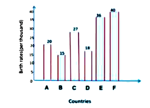
- The following bar chart represents the birth rate (per thousand)of six...
Text Solution
|
- The pie-chart shows percentage wise distribution of teachers who teach...
Text Solution
|
- The following bar chart represents the birth rate (per thousand)of six...
Text Solution
|
- The pie-chart shows the percentage-wise distribution of the number of ...
Text Solution
|
- Study the following graph and answer the given question . The graph ...
Text Solution
|
- Study the following graph and answer the given question . The graph ...
Text Solution
|
- The pie-chart shows the percentage-wise distribution of the number of ...
Text Solution
|
- The bar graph shows the number of students (in hundreds) admitted and ...
Text Solution
|
- The pie chart shows the annual car production (percentage wise) of six...
Text Solution
|
- The pie chart shows the annual car production (percentage wise) of six...
Text Solution
|
- The bar graph shows the number of students (in hundreds) admitted and ...
Text Solution
|
- Study the following bar diagram and answer the question that follows. ...
Text Solution
|
- Study the following bar diagram and answer the question that follows. ...
Text Solution
|
- The following pie chart shows the monthly expenditure incurred by a fa...
Text Solution
|
- The following pie chart shows the monthly expenditure incurred by a fa...
Text Solution
|
- The given bar graph represents the number of students who appeared in ...
Text Solution
|
- The following pie chart shows the percentage-wise distribution of the ...
Text Solution
|
- The given bar graph represents the number of students who appeared in ...
Text Solution
|