A
B
C
D
Text Solution
Verified by Experts
The correct Answer is:


Topper's Solved these Questions
Similar Questions
Explore conceptually related problems
PINNACLE-DATA INTERPRETATION-EXERCISE
- The given chart shows the number of students in Class 4, Class 5, Clas...
Text Solution
|
- The given chart shows the number of students in Class 4, Class 5, Clas...
Text Solution
|
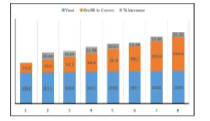
- The following graph shows the profit ( in crore ₹) earned by a compan...
Text Solution
|
- The given pie chart shows the percentage of students enerolled int...
Text Solution
|
- The following graph shows the data of five companies A, B,C, D, E with...
Text Solution
|
- The following graph shows the data of the number of candidates that ap...
Text Solution
|
- The given bar chart shows the number of students in a class who have s...
Text Solution
|
- The given bar chart shows the number of students in a class who have s...
Text Solution
|
- The given bar chart shows the number of students in a class who have s...
Text Solution
|
- The given bar chart shows the number of students in a class who have s...
Text Solution
|
- The following chart shows the sales (in thousands) of pens , pencil...
Text Solution
|
- The following charts shows the sales (in thousands) of pens , pencils ...
Text Solution
|
- The following chart shows the sales ( in thousands ) of pens , pencil...
Text Solution
|
- The following chart shows the sales (in thousands) of pencils and book...
Text Solution
|
- The given bar graph represents the production and sales of certain c...
Text Solution
|
- The given bar graph represents the producution and sales of a certain ...
Text Solution
|
- The given bar graph represents the production and sales of a certain ...
Text Solution
|
- The given bar graph respresents the production and sale of a certain ...
Text Solution
|
- The given bar graph shows the biscuit exports of India over a period o...
Text Solution
|
- The given bar graph represents the number of teachers in different wei...
Text Solution
|