A
B
C
D
Text Solution
Verified by Experts


Topper's Solved these Questions
Similar Questions
Explore conceptually related problems
PINNACLE-DATA INTERPRETATION-EXERCISE
- The given histogram shows the height of the students. The differe...
Text Solution
|
- The given histogram shows the height of the students. What is th...
Text Solution
|
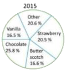
- The given pie chart represents the popularity of ice-cream flavours in...
Text Solution
|
- The given histogram shows the height of the students The number o...
Text Solution
|
- The given pie chart represents the popularity of ice-cream flavours in...
Text Solution
|
- The given pie char represents the popularity of ice-cream flavours in ...
Text Solution
|
- The given bar graph shows the number of students of two schools over a...
Text Solution
|
- The given histogram shows the frequency distribution of the speed of c...
Text Solution
|
- The given bar graph represents the number of boys and girls in five di...
Text Solution
|
- The given pie chart shows the percentage distribution of 450 employees...
Text Solution
|
- The given histogram shows the frequency distribution of the speed of c...
Text Solution
|
- The given pie chart shows the percentage distribution of 450 employees...
Text Solution
|
- In the given bar graph what is the ratio of the total boys and girls i...
Text Solution
|
- The given pie chart shows the percentage distribution of 450 employees...
Text Solution
|
- The given bar graph represents the number of bodys and girls in five d...
Text Solution
|
- The given histogram shows the frequency distribution of the speed of c...
Text Solution
|
- The given pie chart shows the percentage distribution of 450 employees...
Text Solution
|
- The given histogram shows the frequency distribution of the speed of c...
Text Solution
|
- The given pie chart shows the percentage distribution of 450 employees...
Text Solution
|
- The given histogram shows the frequency distribution of the speed of c...
Text Solution
|