


NCERT-COAL AND PETROLEUM-QUESTION
- What are the advantages of using CNG and LPG as fuels?
Text Solution
|
- Name the petroleum product used for surfacing of roads
Text Solution
|
- Describe how coal was formed. What is this process called?
Text Solution
|
- Fill in the banks. Fossil fuels are , and .
Text Solution
|
- Fill in the blanks. The process of separating the various constituen...
Text Solution
|
- Fill in the following blanks with suitable words: e) The least pollu...
Text Solution
|
- Tick True/False against the following statements Fossil fuels can b...
Text Solution
|
- Tick True/False against the following statements CNG is more polluti...
Text Solution
|
- Tick True/False against the following statements Coke is almost pure...
Text Solution
|
- State whether the following statements are true or false : b) Coal t...
Text Solution
|
- State whether the following statements are true or false : c) Kerose...
Text Solution
|
- Explain why fossil fuels are exhaustible natural resources
Text Solution
|
- Describe characteristics and uses of coke.
Text Solution
|
- Explain the process of formation of petroleum
Text Solution
|
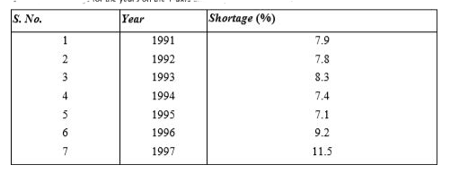
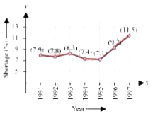
- The following Table shows the total power shortage in India from 1991 ...
Text Solution
|