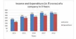
 In which year is the Expenditure more than 40% as compared to the Expenditure in the previous year?
 A
B
C
D
Text Solution
Verified by Experts
The correct Answer is:


Topper's Solved these Questions
Similar Questions
Explore conceptually related problems
MOTHERS-DATA INTERPRETATION-MULTIPLE CHOICE QUESTIONS
- the given bar graph presents income and Expenditure of a company for t...
Text Solution
|
- the given bar graph presents income and Expenditure of a company for t...
Text Solution
|
- The given Bar Graph presents Income and Expenditure (in crores of Rupe...
Text Solution
|
- the given bar graph presents income and Expenditure of a company for t...
Text Solution
|
- The given bar graph presents the Revenue and Expenditure of a company ...
Text Solution
|
- The expenditure of the company in 2017 is what percentage less than th...
Text Solution
|
- The total expenditure of the company from 2016 to 2018 is what percent...
Text Solution
|
- The given bar graph presents the Revenue and Expenditure of a company ...
Text Solution
|
- The given bar graph presents the results in terms of number of student...
Text Solution
|
- What is the average of failed students in five academic years?
Text Solution
|
- The difference between the number of students passed and those who fai...
Text Solution
|
- What is the approximate percentage of students passed during five acad...
Text Solution
|
- The given bar graph presents the Imports and Exports of an item manufa...
Text Solution
|
- What is the ratio of total exports to total Imports during the five fi...
Text Solution
|
- The given Bar Graph presents the Imports and Exports of an item (in to...
Text Solution
|
- The given bar graph presents the Imports and Exports of an item manufa...
Text Solution
|
- The given bar graph presents the imports and Exports of an item manufa...
Text Solution
|
- In which financial year, total of Exports and Imports is the highest?
Text Solution
|
- In which financial year the percentage increase in imports is the high...
Text Solution
|
- What is the average of export during the five financial years?
Text Solution
|