Home
Class 14
MATHS
The line graph shows electricity consump...

The line graph shows electricity consumption for three households A,B and C for months february to May.

In the given line graph, the difference between the total electrical consumption between months february and April is:

A

97

B

74

C

121

D

15

Text Solution

Verified by Experts

The correct Answer is:
C
Promotional Banner

Topper's Solved these Questions

  • COMPOUND INTEREST

    MOTHERS|Exercise CLASS ROOM EXERCISES |180 Videos
  • GEOMETRY

    MOTHERS|Exercise MULTIPLE CHOICE QUESTIONS |413 Videos

Similar Questions

Explore conceptually related problems

The line graph shows electricity consumption for three households A, B and C for months february to May IN the line graph the percentage increase in electricity consumption of B between march and May is :

The line graph shows electricity consumption for three households A, B and C for months february to May IN thegiven line graph the electricity charges collected from all (A B C) for the month of February is:

What is the basic difference between magnetic and electric lines of force?

What is the basic difference between electric and magnetic field lines?

The line graph shows the temperature on four Sundays of three cities. In the given line graph. what was the difference in temperature between Delhi and Chennai on the 3^(rd) Sunday?

The line graph shows the temperature on four Sundays of three cities. In the given line graph, what was the difference in temperature between Delhi and Mumbai on the 2^(nd) Sunday ?

The line graph shows the temperature on four sundays of three cities In the given line graph what was the difference in temperature between Delhi and Mumbai on the 2nd Sunday?

The line graph shows the temperature on four Sunday of three cities In the given graph, what was the difference in temperature between Delhi and Chennai on the 3rd Sunday?

The line graph shows the temperature on four Sundays of three cities In the given line graph , what was the average temperature on the 1st Sunday in all the three cities?

The line graph shows the temperature on four Sundays of three cities. In the given line graph, when was the maximum temperature recorded in Delhi?

MOTHERS-DATA INTERPRETATION-MULTIPLE CHOICE QUESTIONS
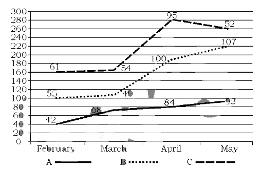
  1. The line graph shows electricity consumption for three households A, B...

    Text Solution

    |

  2. The given pie chart depicts the percentage of students coming to schoo...

    Text Solution

    |

  3. The line graph shows electricity consumption for three households A,B ...

    Text Solution

    |

  4. The given bar chart shows the details of cycle sales by a company betw...

    Text Solution

    |

  5. The line graph shows the monthly expenditure by two families in hundre...

    Text Solution

    |

  6. The given bar chart shows the sales of books in four metro branches of...

    Text Solution

    |

  7. The given pie chart depicts the expenditure incurred in crores towards...

    Text Solution

    |

  8. The given pie chart depicts the expenditure incured in crores towards ...

    Text Solution

    |

  9. The line graph shows the monthly expenditure by two families in hundre...

    Text Solution

    |

  10. The line graph shows the monthly expenditure by two families in hundre...

    Text Solution

    |

  11. The given bar chart shows the sales of books in four metro branches of...

    Text Solution

    |

  12. The given bar chart shows the sales of books in four metro branches of...

    Text Solution

    |

  13. The given pie chart depicts the expenditure incurred in crores towards...

    Text Solution

    |

  14. The given bar chart shows production of steel by companies A , B , C a...

    Text Solution

    |

  15. The given bar chart production of steel by companies A , B, c and D fo...

    Text Solution

    |

  16. the given pie chart shows the number of tourists for the year 2015, tr...

    Text Solution

    |

  17. The given pie chart shows the number of tourists for the year 2015, tr...

    Text Solution

    |

  18. The given bar chart shows production of steel by companies A , B , C a...

    Text Solution

    |

  19. The table shows income and expenditure of a person for 3 years I...

    Text Solution

    |

  20. The given pie chart shows the number of tourists for the year 2015 tra...

    Text Solution

    |