A
B
C
D
Text Solution
Verified by Experts
The correct Answer is:


Topper's Solved these Questions
Similar Questions
Explore conceptually related problems
MOTHERS-DATA INTERPRETATION-MULTIPLE CHOICE QUESTIONS
- The given pie chart depicts the expenditure incurred in crores towards...
Text Solution
|
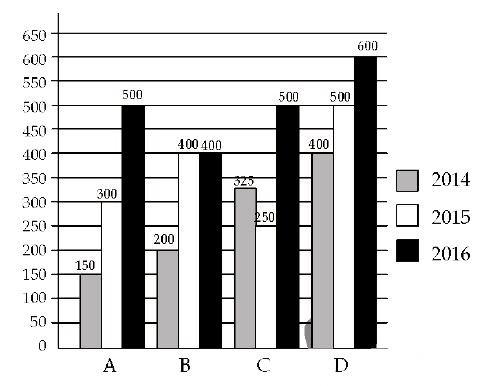
- The given bar chart shows production of steel by companies A , B , C a...
Text Solution
|
- The given bar chart production of steel by companies A , B, c and D fo...
Text Solution
|
- the given pie chart shows the number of tourists for the year 2015, tr...
Text Solution
|
- The given pie chart shows the number of tourists for the year 2015, tr...
Text Solution
|
- The given bar chart shows production of steel by companies A , B , C a...
Text Solution
|
- The table shows income and expenditure of a person for 3 years I...
Text Solution
|
- The given pie chart shows the number of tourists for the year 2015 tra...
Text Solution
|
- The table shows income and expenditure of a person for 3 years I...
Text Solution
|
- The table shows income and expenditure of a person for 3 years In...
Text Solution
|
- The given bar chart shows population of 4 different states in 3 years ...
Text Solution
|
- The given bar chart shows population of 4 different states in 3 years ...
Text Solution
|
- The given pie chart shows the taxable income for A B C and D in lakhs ...
Text Solution
|
- The line graph shows the temperature on four Sundays of three cities ...
Text Solution
|
- The line graph shows the temperature on four Sundays of three cities ...
Text Solution
|
- The line graph shows the temperature on four Sunday of three cities ...
Text Solution
|
- The given pie chart shows the taxable income for A,B , C and D in lakh...
Text Solution
|
- The given bar chard shows population of 4 different states in 3 years ...
Text Solution
|
- The given pie chart shows the taxable income for A , B , C and D in la...
Text Solution
|
- The given bar chart shows number of marks scored by a student in each ...
Text Solution
|