A
B
C
D
Text Solution
Verified by Experts
The correct Answer is:


Topper's Solved these Questions
Similar Questions
Explore conceptually related problems
MOTHERS-DATA INTERPRETATION-MULTIPLE CHOICE QUESTIONS
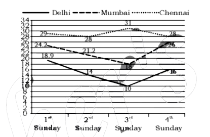
- The line graph shows the temperature on four sundays of three cities ...
Text Solution
|
- The given bar chart shows number of marks scored by a student in each ...
Text Solution
|
- The line graph shows the temperature on four sundays of three cities ...
Text Solution
|
- The given pie chart shows runs scored by A in 6 matches In the gi...
Text Solution
|
- The given pie chart shows scored by A in 6 matches In the given p...
Text Solution
|
- The given pie chart shows runs scored by A in 6 matches In the gi...
Text Solution
|
- The given bar chart shows number of marks scored by a student in each ...
Text Solution
|
- The line graph shows the temperature on four sundays all three cities ...
Text Solution
|
- The given pie chart shows favorite shows of student of a school I...
Text Solution
|
- The given bar chart shows the sales for sets of television of three co...
Text Solution
|
- The table below shows the admission and transfer in standars 1-3 of a ...
Text Solution
|
- The given bar chart shows the sales for sets of television of three co...
Text Solution
|
- The given bar chart, shows the sales for sets of television of three c...
Text Solution
|
- The given pie chart shows favorite shows of student of a school I...
Text Solution
|
- The given pie chart shows favorite sport of students of A school In...
Text Solution
|
- The table below shows the admission and transfer in standars 1-3 of a ...
Text Solution
|
- The given bar chart shows the sales of books from six branches of a pu...
Text Solution
|
- The given pie chart shows the percentage distribution of the expenditu...
Text Solution
|
- The line graph shows the production of product A and B during the peri...
Text Solution
|
- The given pie chart shows the percentage distribution of the expenditu...
Text Solution
|