A
B
C
D
Text Solution
Verified by Experts
The correct Answer is:


Topper's Solved these Questions
Similar Questions
Explore conceptually related problems
MOTHERS-DATA INTERPRETATION-MULTIPLE CHOICE QUESTIONS
- The given histogram represents the frequency distribution of average r...
Text Solution
|
- The given histogram represents the frequency distribution of average r...
Text Solution
|
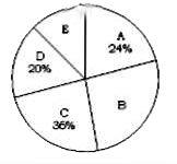
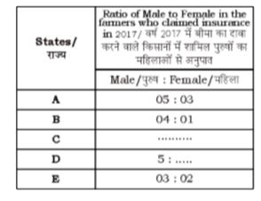
- The following pie chart and table show the percentage distribution of ...
Text Solution
|
- Out of the bar graphs provided below one shows the amount invested a ...
Text Solution
|
- The give histogram represents the frequency distribution of average ru...
Text Solution
|
- The given bar chart represents the average marks obtained in English E...
Text Solution
|
- The given bar chart presents the average marks obtained in English (E)...
Text Solution
|
- Study the graph and answer the question The number of workers in ...
Text Solution
|
- Study the graph and answer the question Total production of wheat ...
Text Solution
|
- Study the graph and answer the question the ratio of the total pr...
Text Solution
|
- Study the pie chart and answer the question. Distribution of the numbe...
Text Solution
|
- Study the graph and answer the question The number of states in w...
Text Solution
|
- Study the pie chart and answer the question. Distribution of the numbe...
Text Solution
|
- Study the pie chart and answer the question Distribution of the number...
Text Solution
|
- Study the graph and answer the question The number of workers in ...
Text Solution
|
- Study the graph the answer the question The ratio of the number o...
Text Solution
|
- Study the given graph and answer the question that follows What i...
Text Solution
|
- Study the given graph and answer the question that follows the num...
Text Solution
|
- Study the given graph and answer the question that follows Total ...
Text Solution
|
- Study the giiven graph and answer that follows What is the ratio ...
Text Solution
|