Text Solution
Verified by Experts
The correct Answer is:


Topper's Solved these Questions
DATA HANDLING
SWAN PUBLICATION|Exercise EXERCISE 3.4|9 VideosDATA HANDLING
SWAN PUBLICATION|Exercise EXERCISE 3.4 (MULTIPLE CHOICE QUESTIOS)|6 VideosDATA HANDLING
SWAN PUBLICATION|Exercise EXERCISE 3.2 (MULTIPLE CHOICE QUESTIONS)|4 VideosCONGRUENCE OF TRIANGLES
SWAN PUBLICATION|Exercise OTHER IMPORTANT QUESTIONS (III: State whether following statements are true or false)|8 VideosEXPONENTS AND POWERS
SWAN PUBLICATION|Exercise OTHER IMPORTANT QUESTIONS (TRUE FALSE)|8 Videos
Similar Questions
Explore conceptually related problems
SWAN PUBLICATION-DATA HANDLING-EXERCISE 3.3
- Following data gives total marks (out of 600) obtained by six students...
Text Solution
|
- Read the bar graph which shows the number of books sold by a bookstore...
Text Solution
|
- The following bar graph shows the number of books sold by a bookstore ...
Text Solution
|
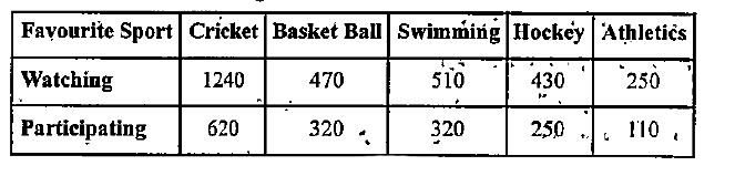
- Two hundred students of 6th and 7th class were asked to name their fav...
Text Solution
|
- Two hundred students of 6th and 7th class were asked to name their fav...
Text Solution
|
- Two hundred students of 6th and 7th class were asked to name their fav...
Text Solution
|
- Consider the following data collected from a survery of a colony : ...
Text Solution
|
- Consider the following data collected from a survery of a colony : ...
Text Solution
|
- The following table shows the time (in hours) Spent by a student of cl...
Text Solution
|