Home
Class 14
MATHS
The graph given below shows the daily in...

The graph given below shows the daily income of 50 workers in a factory Study the graph and answer the questions

कारखाने में मजदूरी का औसत माध्य कितना है ।

A

`6%`

B

`16%`

C

`12%`

D

`20%`

Text Solution

Verified by Experts

The correct Answer is:
B
Promotional Banner

Topper's Solved these Questions

  • STATISTICS AND DATA INTERPRETATION

    KIRAN PUBLICATION|Exercise TYPE-VII|363 Videos
  • STATISTICS AND DATA INTERPRETATION

    KIRAN PUBLICATION|Exercise TYPE-VIII|8 Videos
  • STATISTICS AND DATA INTERPRETATION

    KIRAN PUBLICATION|Exercise TYPE-V|38 Videos
  • SIMPLIFICATION

    KIRAN PUBLICATION|Exercise TEST YOURSELF|25 Videos
  • TIME AND DISTANCE

    KIRAN PUBLICATION|Exercise Type -XI|74 Videos

Similar Questions

Explore conceptually related problems

The graph shows Income and Expenditure of a company. Study the graph and answer the questions. The profit was maximum in the year

In the given bar graph, the Blue bar shows the income and the Red bar shows the expenditure of a company. Study the graph and answer the question that follows दिए गए दंड आरेख में, नीला दंड एक कंपनी की आय दिखाता है और लाल दंड खर्च (लाख रुपये में) को दर्शाता है। आरेख का अध्ययन करें और उस प्रश्न का उत्तर दें जो नीचे पूछा गया है। The percentage decrease in the income of the company in 2002 as compared to that in 2001 is: 2001 की तुलना में 2002 में कंपनी की आय में कितने प्रतिशत में कमी आई है:

In the given bar graph, the Blue bar shows the income and the Red bar shows the expenditure of a company. Study the graph and answer the question that follows दिए गए दंड आरेख में, नीला दंड एक कंपनी की आय दिखाता है और लाल दंड खर्च (लाख रुपये में) को दर्शाता है। आरेख का अध्ययन करें और उस प्रश्न का उत्तर दें जो नीचे पूछा गया है। The income in 2001 was equal to the expenditure in the year: 2001 में आय किस वर्ष के व्यय के बराबर है :

The pie chart given below shows the spendings of a family on various heads during a month. Study the graph and answer the questions If the total income of the family is Rs . 25,000, then the amount spent on Rent and Food together is

In the given bar graph, the Blue bar shows the income and the Red bar shows the expenditure of a company. Study the graph and answer the question that follows दिए गए दंड आरेख में, नीला दंड एक कंपनी की आय दिखाता है और लाल दंड खर्च (लाख रुपये में) को दर्शाता है। आरेख का अध्ययन करें और उस प्रश्न का उत्तर दें जो नीचे पूछा गया है। The expenditure from 2001 to 2002 decreased by: 2001 से 2002 तक व्यय में कितनी कमी आई है?

The following graph shows the sales of cars (in thousands) in four cities in 4 years. Study the graph and answer the questions. निम्नलिखित आरेख 4 वर्षों में चार शहरों में कारों की बिक्री (हज़ार में) को दर्शाता है। इस आरेख का अध्ययन कीजिए तथा प्रश्नों के उत्तर दीजिए। In 2019, what is the average number of sales among all the four cities? 2019 में, सभी चार शहरों में औसत बिक्री कितनी रही है?

KIRAN PUBLICATION-STATISTICS AND DATA INTERPRETATION-TYPE-VI
  1. A class is divided into 3 equal groups and the class is given 5 test i...

    Text Solution

    |

  2. The following graph represents the maximum and minimum temperature rec...

    Text Solution

    |

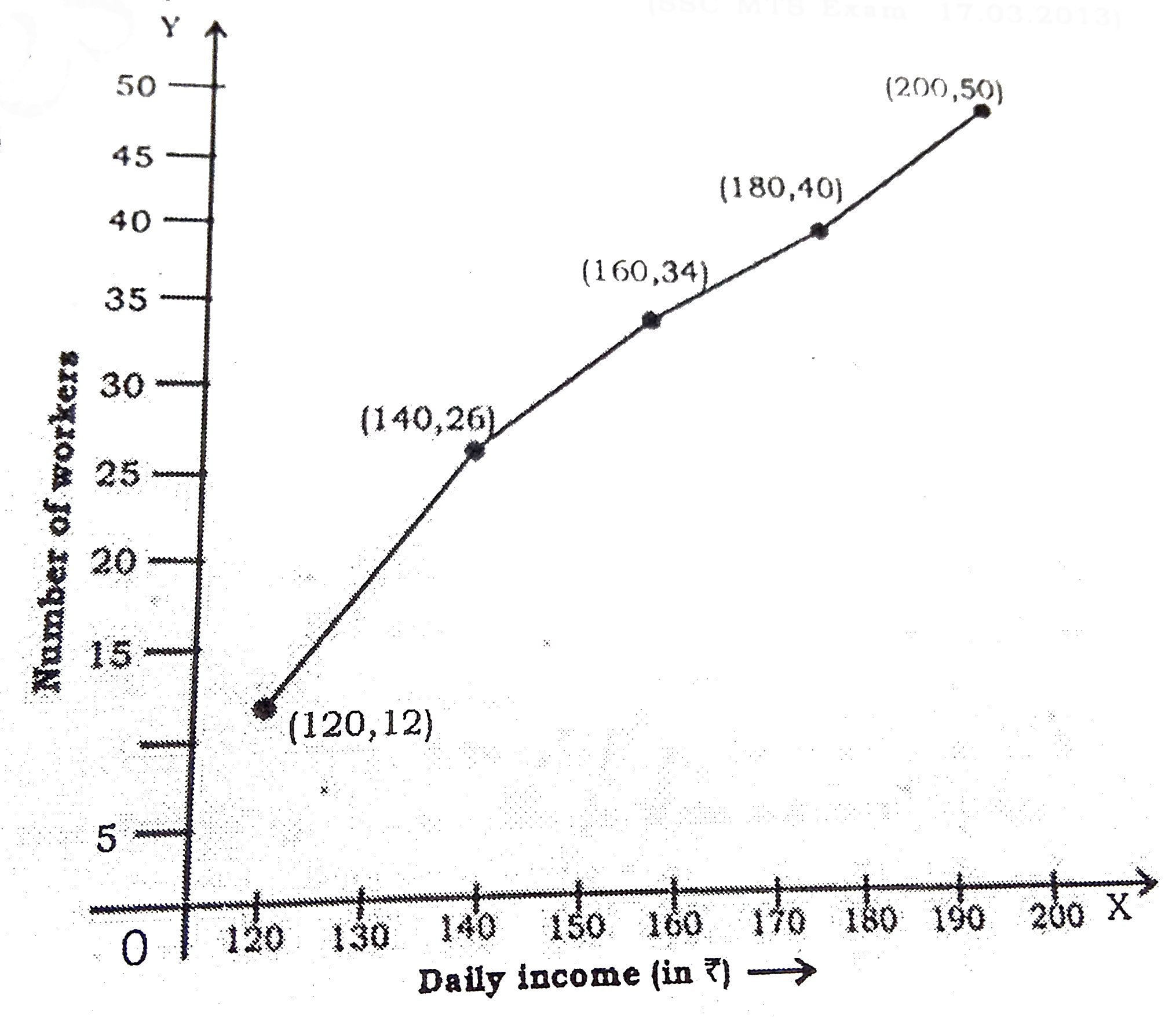
  3. The graph given below shows the daily income of 50 workers in a factor...

    Text Solution

    |

  4. The graph given below the daily income of 50 workers in a factory. Stu...

    Text Solution

    |

  5. Study the following graph and answer the questions. Find the perc...

    Text Solution

    |

  6. Study the following graph and answer the questions. If the income...

    Text Solution

    |

  7. The adjoining diagram is frequency polygon for the scores of students ...

    Text Solution

    |

  8. Given is a line graph showing the number of accidents in a city during...

    Text Solution

    |

  9. Study the following graph and answer the questions. If the import...

    Text Solution

    |

  10. Study the following graph and answer the questions. In 2005, the ...

    Text Solution

    |

  11. The marks obtained by 273 examinees are shown by the frequency polygon...

    Text Solution

    |

  12. The marks obtained by 273 examinees are shown by the frequency polygon...

    Text Solution

    |

  13. The marks obtained by 273 examinees are shown by the frequency polygon...

    Text Solution

    |

  14. The marks obtained by 273 examinees are shown by the frequency polygon...

    Text Solution

    |

  15. The following graph shows production (in thousands) of two types (P an...

    Text Solution

    |

  16. The following graph shows production (in thousands) of two types (P an...

    Text Solution

    |

  17. The following graph shows production (in thousands) of two types (P an...

    Text Solution

    |

  18. The following graph shows production (in thousands) of two types (P an...

    Text Solution

    |

  19. The following graph shows production (in thousands) of two types (P an...

    Text Solution

    |

  20. Observe the graph below and answer the following question. What i...

    Text Solution

    |