A
B
C
D
Text Solution
Verified by Experts
The correct Answer is:


Topper's Solved these Questions
STATISTICS AND DATA INTERPRETATION
KIRAN PUBLICATION|Exercise TYPE-VII|363 VideosSTATISTICS AND DATA INTERPRETATION
KIRAN PUBLICATION|Exercise TYPE-VIII|8 VideosSTATISTICS AND DATA INTERPRETATION
KIRAN PUBLICATION|Exercise TYPE-V|38 VideosSIMPLIFICATION
KIRAN PUBLICATION|Exercise TEST YOURSELF|25 VideosTIME AND DISTANCE
KIRAN PUBLICATION|Exercise Type -XI|74 Videos
Similar Questions
Explore conceptually related problems
KIRAN PUBLICATION-STATISTICS AND DATA INTERPRETATION-TYPE-VI
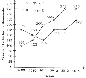
- The following graph shows production (in thousands) of two types (P an...
Text Solution
|
- The following graph shows production (in thousands) of two types (P an...
Text Solution
|
- The following graph shows production (in thousands) of two types (P an...
Text Solution
|
- The following graph shows production (in thousands) of two types (P an...
Text Solution
|
- The following graph shows production (in thousands) of two types (P an...
Text Solution
|
- Observe the graph below and answer the following question. What i...
Text Solution
|
- Observe the graph below and answer the following question. In whi...
Text Solution
|
- Observe the graph below and answer the following question. What i...
Text Solution
|
- Study the following line chart carefully and answer the questions give...
Text Solution
|
- Study the following line chart carefully and answer the questions give...
Text Solution
|
- Study the following line chart carefully and answer the questions give...
Text Solution
|
- Study the following line chart carefully and answer the questions give...
Text Solution
|
- Study the following line chart carefully and answer the questions give...
Text Solution
|
- The line chart given below shows the ratio of poduction to sales of tw...
Text Solution
|
- The line chart given below shows the ratio of production to sales of t...
Text Solution
|
- The line chart given below shows the ratio of poduction to sales of tw...
Text Solution
|
- The line chart given below shows the ratio of poduction to sales of tw...
Text Solution
|
- The line chart given blow represents the sales (in 00) of trousers ans...
Text Solution
|
- The line chart given blow represents the sales (in 00) of trousers ans...
Text Solution
|
- The line chart given blow represents the sales (in 00) of trousers ans...
Text Solution
|