A
B
C
D
Text Solution
Verified by Experts
The correct Answer is:


Topper's Solved these Questions
STATISTICS AND DATA INTERPRETATION
KIRAN PUBLICATION|Exercise TYPE-VII|363 VideosSTATISTICS AND DATA INTERPRETATION
KIRAN PUBLICATION|Exercise TYPE-VIII|8 VideosSTATISTICS AND DATA INTERPRETATION
KIRAN PUBLICATION|Exercise TYPE-V|38 VideosSIMPLIFICATION
KIRAN PUBLICATION|Exercise TEST YOURSELF|25 VideosTIME AND DISTANCE
KIRAN PUBLICATION|Exercise Type -XI|74 Videos
Similar Questions
Explore conceptually related problems
KIRAN PUBLICATION-STATISTICS AND DATA INTERPRETATION-TYPE-VI
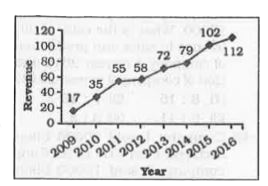
- The line chart given below shows the revenue of a company (in lac rupe...
Text Solution
|
- The line chart given below shows the revenue of a company (in lac rupe...
Text Solution
|
- The line chart given below shows the revenue of a company (in lac rupe...
Text Solution
|
- The line chart given below shows the revenue of a company (in lac rupe...
Text Solution
|
- The line chart given below shows the number of students in 2 sections ...
Text Solution
|
- The line chart given below shows the number of students in 2 sections ...
Text Solution
|
- The line chart given below shows the number of students in 2 sections ...
Text Solution
|
- The line chart given below shows the number of students in 2 sections ...
Text Solution
|
- The line graph shows the number of deaths due to rail accidents in a c...
Text Solution
|
- The line graph shows the number of deaths due to rail accidents in a c...
Text Solution
|
- The line graph shows the number of deaths due to rail accidents in a c...
Text Solution
|
- The line graph shows the number of deaths due to rail accidents in a c...
Text Solution
|
- The line graph shows the number of students who passed with distinctio...
Text Solution
|
- The line graph shows the number of students who passed with distinctio...
Text Solution
|
- The line graph shows the number of students who passed with distinctio...
Text Solution
|
- The line graph shows the number of students who passed with distinctio...
Text Solution
|
- The line graph shows the number of vacancies for sales officers in a c...
Text Solution
|
- The line graph shows the number of vacancies for sales officers in a c...
Text Solution
|
- The line graph shows the number of vacancies for sales officers in a c...
Text Solution
|
- The line graph shows the number of vacancies for sales officers in a c...
Text Solution
|